Accessible Digital Content for Hosts: A Practical Guide
Learn how short-term rental hosts can create accessible digital content with WCAG basics, plain language, alt text, and testing in this practical guide.
1.3 billion people worldwide live with a disability, according to the World Health Organization estimate summarized by World Metrics. The 2026 WebAIM Million report also found that 95.9% of the top one million homepages had detectable WCAG 2 failures, with an average of 56.1 errors per page, as reported by AudioEye's accessibility statistics review. Those figures come from the wider web, yet the same barriers can appear in a short-term rental welcome book.
A screen reader that cannot interpret the Wi-Fi page, a low-contrast door code, or a caption-free video can turn arrival into a stressful support request. For hosts, accessible digital content means guests can find, read, and use instructions without relying on someone else.
This guide applies the four WCAG principles to one practical asset, your QR-first digital welcome book and the ScanStay workflow you already use. You will edit the pages guests depend on, test them on a phone, and check common situations such as finding entry instructions or the thermostat guide. The printable checklist then turns those checks into a repeatable pre-arrival routine.
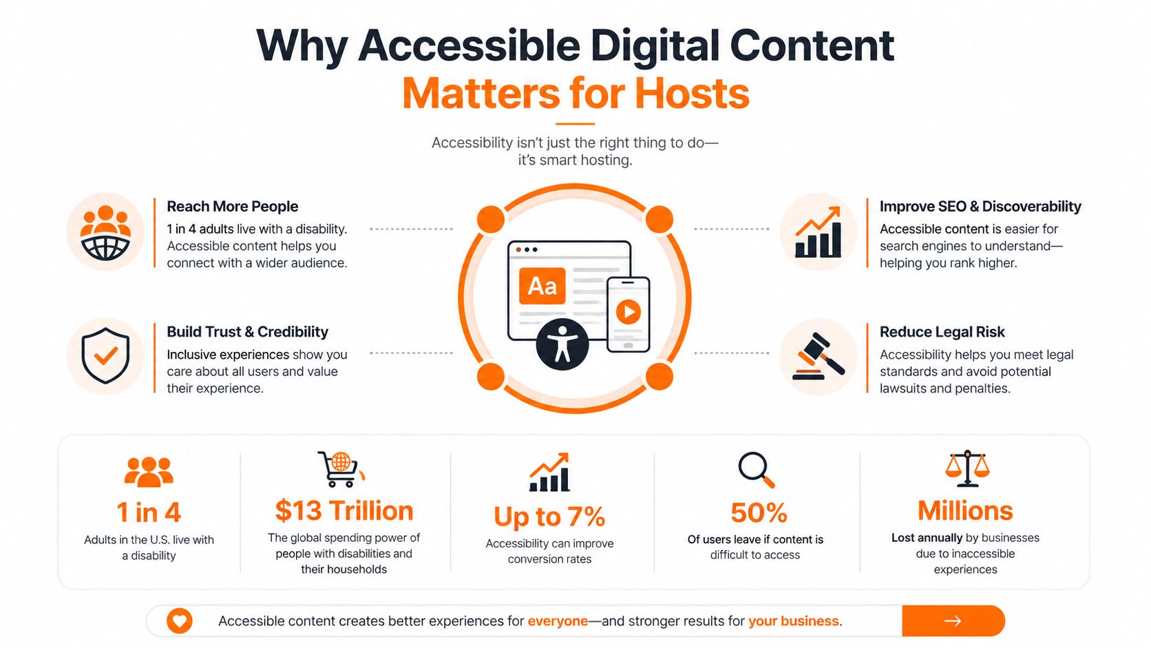
Table of Contents
- Why Accessible Digital Content Matters for Hosts
- The WCAG Basics Hosts Actually Need
- Editing Your Welcome Book So Every Guest Can Use It
- Real Guest Scenarios That Show What Changes
- How to Test Your Welcome Book Before Guests Arrive
- The Host Accessibility Checklist for ScanStay
- Putting It All Together Tonight
Why Accessible Digital Content Matters for Hosts
Guests experience accessibility through simple tasks: finding the entrance instructions, reading the thermostat guide, or locating the Wi-Fi password without asking for help. A welcome book that works for one visitor but blocks another creates friction when guests are tired, unfamiliar with the property, and relying on a phone.
The audience is broader than many hosts assume. People with disabilities represent a substantial share of the global population, so accessible content is a practical audience requirement, not a rare accommodation. Guests may use screen readers, browser zoom, captions, keyboard navigation, high-contrast settings, or larger text because they are reading in a dim room or bright kitchen.
Widespread accessibility failures across the web offer hosts a useful warning. A short-term rental guide does not need the complexity of a major website, but it does need the same discipline: readable text, meaningful structure, usable controls, and information that assistive technology can interpret. A QR-first ScanStay welcome book makes these checks part of the arrival workflow, provided each page is written for real phone use rather than treated as a decorative brochure.
The practical standard is straightforward.
Practical rule: If a guest needs information to complete a task, publish it as clear, selectable text instead of hiding it inside an image or decorative design.
Accessible edits also improve everyday usability. Short instructions help a tired traveler. Clear headings help someone scanning on a small screen. Captions help a guest who cannot play audio in a shared space. Strong contrast makes a door code easier to read in bright kitchen light, while useful alt text gives a screen-reader user an equivalent description.
Use the welcome book as a task tool: test the QR entry point, check the pages guests need first, and remove obstacles before arrival. That approach protects access without making the guide harder for anyone else to use.
The WCAG Basics Hosts Actually Need
WCAG can sound like developer language, but its four principles translate neatly into host decisions. The framework is often summarized as Perceivable, Operable, Understandable, and Reliable, or POUR. The WCAG accessibility standards guide for hosts offers additional context for applying those principles to rental content.
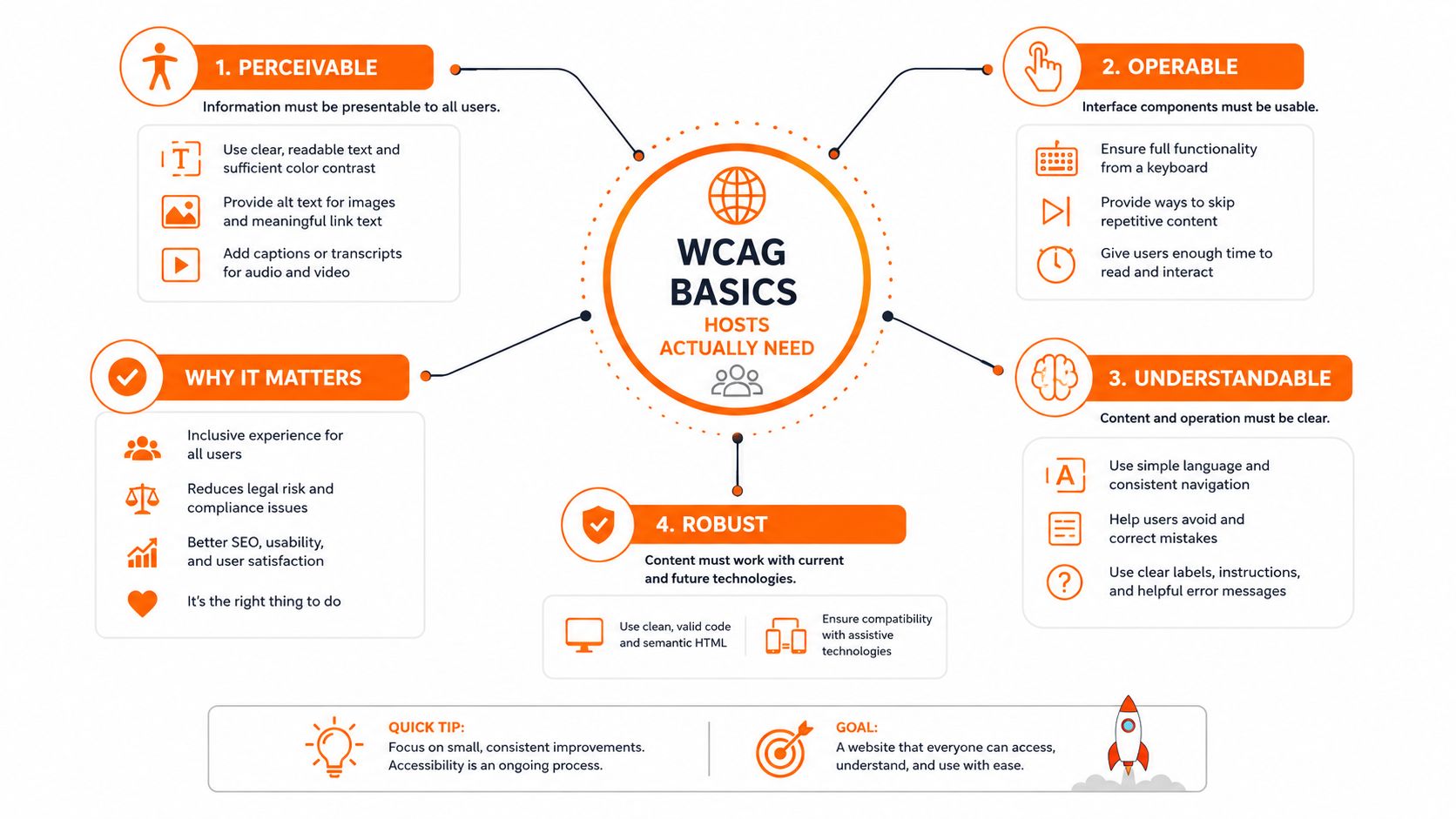
Perceivable information can be seen or heard
Guests need more than information being present. They need to perceive it. A dark Wi-Fi card with gray text may be technically visible but unreadable in bright kitchen light. A property photo without useful alt text gives a blind guest no equivalent description through a screen reader.
Welcome book fix: Put the network name and password in live text with strong contrast, and describe informative images in concise alt text.
Operable controls don't depend on one input method
A guest should be able to move through the guide with touch, a keyboard, or assistive technology. Links must receive focus in a sensible order, buttons need clear labels, and controls shouldn't be so small that a guest with limited dexterity struggles to activate them.
Welcome book fix: Test every link and button with keyboard navigation, then repeat the task on a phone using one thumb.
Understandable instructions reduce interpretation
House rules should use familiar words and direct sentences. “Kindly ensure refuse is deposited in the designated receptacle” creates unnecessary work. “Put rubbish in the outside bin” is easier to process, translate, and follow.
Welcome book fix: Give each instruction one action, one time, and one clear location.
Robust content works across devices and assistive technology
Well-structured content uses real headings, selectable text, descriptive links, and standard controls. Those choices help the page render consistently across phones, browsers, zoom levels, and screen readers.
Welcome book fix: Build the Wi-Fi, check-out, and emergency pages with actual text blocks and headings rather than screenshots of printed pages.
Here's a short visual explanation of the framework before you start editing:
Editing Your Welcome Book So Every Guest Can Use It
Start with the pages guests use under pressure, not the cover. Open Wi-Fi, check-in, check-out, house rules, emergency, and appliance pages. Edit their wording, order, and task flow before polishing branding. A practical digital welcome book workflow makes those repeated changes easier to maintain across properties and keeps the QR-first guide consistent from one stay to the next.
Make each task easy to scan
Put the action first and give it a clear boundary. Replace:
“Guests are kindly requested to ensure that all windows are securely closed prior to vacating the property.”
with:
“Before you leave, close and lock every window.”
Use familiar words, left-aligned text, and bullets for rules guests need to find quickly. Do not identify controls by color alone. “Press the green button” fails for a guest who cannot distinguish the colors, or whose phone renders them differently. Name the control and state where it is, such as “Press Start on the right side of the panel.”
Short source sentences also make translation easier. Automated systems have fewer clauses and ambiguous references to interpret. ScanStay supports AI translation across 18 languages, according to the publisher's product information, so concise writing gives each translated version a cleaner starting point.
Describe the purpose of images
Write alt text around the information a guest needs from an image. For a router photo, “Black router on the shelf beside the television, with the network label on the front” tells a screen-reader user more than “router.jpg.” For a map screenshot, identify the destination and the route the guest must follow.
Review each image with one question: what decision or action should this help the guest make? A photo of a hidden key box needs its position relative to a recognizable feature. A decorative image that adds no instructions should not interrupt the reading order with a needless description.
Alt text and captions serve different jobs. A caption identifies or explains an image for everyone. Alt text supplies an equivalent text description for guests using assistive technology.
Give each page a task-based structure
Use one page title, followed by real headings that match the guest's questions. A Wi-Fi page could use “Connect to Wi-Fi,” “Network name,” and “Password.” A check-out page could use “Before leaving,” “Key return,” and “Final message.”
Keep related details together. Put the access code near the door location, and place the emergency contact method beside the emergency instructions. This reduces backtracking for a guest reading on a small phone, especially after scanning a QR code in a hallway or kitchen.
Do not create headings by enlarging bold text manually. Semantic headings let assistive technology move through the page, while visual styling alone does not. Link labels need the same care. “See airport transfer options” gives useful context; “Click here” does not.
Set a readable visual hierarchy
Text needs enough contrast to remain readable in the conditions where guests use it. Body text should meet a 4.5:1 contrast ratio, and large text should meet 3:1, as specified in the practical editing requirements for this guide. Check the combinations in colored cards, buttons, image overlays, and dark-mode views.
A pale gray font can look refined in a design preview and disappear on a phone in bright kitchen light. Put urgent details on solid backgrounds, choose a readable typeface, and keep long paragraphs off photographs. Use spacing, headings, and short blocks to show what deserves attention before adding decorative elements.
Test the complete guest path
Every interactive element should work with a keyboard and remain easy to activate on a phone. Use clear labels, visually distinct buttons, and touch targets of at least 44 by 44 pixels where the platform allows that control.
Test a full journey rather than isolated links. Open the Wi-Fi page, return to the main menu, find check-out instructions, and open a map. Then repeat the path from the QR code on the same phone a guest will use. Check whether focus moves in a sensible order, whether the back path is clear, and whether returning from an external map loses the welcome book.
Caption instructional videos and provide a text route
A thermostat demonstration may rely on spoken guidance, button sounds, and visual movement. Add accurate captions that name the buttons, record temperature changes, and identify relevant sounds. Captions also help guests in a quiet shared room or anyone using a device with sound disabled.
Place a short transcript below the video. List the actions in sequence, including how to stop the cycle, so a guest can follow the process without replaying the clip repeatedly. If the video loads slowly, the transcript still gives the guest a usable alternative.
Keep source content ready for translation
Avoid idioms, jokes, unexplained abbreviations, and sentences containing several actions. Write “Turn the dial to 22 degrees” instead of “Give the thermostat a little nudge until the room feels right.” The first version is clearer for guests and more dependable when translated.
Review the source text whenever a device, lock, contact method, or house rule changes. One accurate update is easier to apply across languages and properties than a collection of copied screenshots or improvised edits.
Real Guest Scenarios That Show What Changes
A parent arrives with a stroller, a suitcase, and a tired child. She opens the welcome book one-handed in the hallway and needs the Wi-Fi password before she can message anyone. If the page requires pinching to enlarge a tiny image, the password is effectively hidden. A large, high-contrast text block lets her read it immediately, while a responsive page means she can scroll without fighting the layout.
The fix is simple: publish the network name and password as selectable text, give the block a strong contrast ratio, and keep the line short. She shouldn't need to zoom, rotate the phone, or ask a host to repeat a credential she should already have.
A guest with dyslexia arrives after a long flight and reaches the check-out page before unpacking. Dense paragraphs force her to reread the same instruction. Left-aligned text, short sentences, descriptive headings, and bolded deadlines make the relevant information easier to locate.
The meaningful change isn't cosmetic. “Check out by 10:00. Put the keys in the lockbox. Close the door” gives her three distinct actions. A long paragraph can conceal the same details even when the wording is technically correct.
A wheelchair user reaches the kitchen and wants to operate the coffee machine, but the printed manual is across the room. The host's short, captioned video shows which button to press, when to wait, and how to stop the cycle. The guest can pause the video, read the captions, and follow the sequence without handling a paper booklet.
These scenarios show why accessibility belongs in the guest journey, not only in a compliance review. The useful question is always, “Can this guest complete the task at the moment they need it?”
How to Test Your Welcome Book Before Guests Arrive
You can catch many practical barriers with a short, repeatable review. Automation helps, but it can't confirm that a guest understands the door instructions or can complete a check-in task from start to finish.
Start with the actual phone experience
Open the live welcome book on a phone near a bright window. Check the page title, Wi-Fi credentials, door code, emergency directions, and primary buttons. Increase browser text size or zoom and look for clipped content, overlapping controls, horizontal scrolling, and text that disappears against an image.
Follow the whole guide with limited input
Use the Tab key on a computer to move through links, buttons, and form controls. On a phone, use the on-screen keyboard and touch navigation where available. Confirm that the focus order follows the visual order and that every control has a meaningful label.
If you can't reach a page without a mouse, or the focus indicator vanishes, treat that as a publishing problem rather than a guest problem.
Check the key color combinations
Enter your background and text colors into the WebAIM Contrast Checker. Aim for 4.5:1 for body text and verify buttons, labels, links, and text placed over photographs separately.
Run an automated scan, then inspect manually
Feed the live URL into WAVE or axe DevTools. Use the report to find missing alternative text, contrast warnings, unlabeled controls, and structural issues. Don't treat a clean automated result as proof that the guide works.
Deque's research, summarized by Be Accessible's web accessibility statistics, found that automated tests identified 57.38% of total issues across sampled audits. The remaining problems often appear during real interaction, especially with focus order, wording, task completion, and assistive technology.
Ask another person to narrate the experience
Have a friend open the guide on their phone and explain what they expect to happen before tapping. You don't need a formal usability lab. Listen for hesitation around the door code, Wi-Fi page, emergency instructions, and check-out steps.
Use QR code best practices for rental hosts when reviewing the poster and scan path, then test the QR code in the location where guests will encounter it. A code that works on a desk may be difficult to scan from a wall with glare or poor lighting.
The Host Accessibility Checklist for ScanStay
Print this checklist and review one welcome book from the guest's point of view. Each line pairs a page with a specific check and a practical correction.
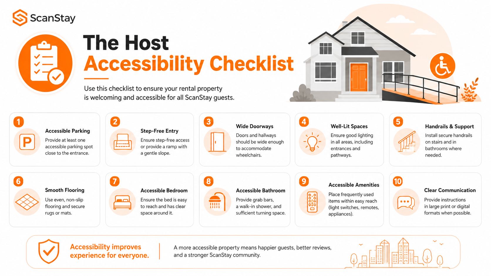
Wi-Fi page
- Network name: Put it in large, selectable text. Replace a screenshot with a live text block.
- Password: Use strong contrast and label it clearly. Remove decorative wording that makes the credential harder to spot.
- Connection help: Give one action per line. Add a plain-language fallback if the guest's device doesn't connect immediately.
House rules
- Sentence length: Keep each rule direct. Replace formal phrases with everyday instructions.
- Visual emphasis: Bold critical times and actions. Remove light gray fine print.
- Lists: Use bullets instead of a dense paragraph. Group related rules under descriptive headings.
Local tips
- Photo descriptions: Add useful alt text to every informative property, restaurant, and attraction image.
- Addresses: Format addresses as readable text, not image-only maps. Include the venue name and destination context.
- Links: Label links by destination, such as “Open the walking route to the market,” rather than “Read more.”
Video how-tos
- Captions: Turn captions on and check that they match the spoken instructions.
- Transcript: Add a short written sequence beneath the video.
- Playback: Keep autoplay off. Let guests pause, replay, and control the volume.
Upsells
- Image meaning: Describe what an airport transfer, equipment rental, or late checkout includes.
- Button labels: Say what happens after the tap. “Request late checkout” is clearer than “Book now.”
- Confirmation: Explain the next step in text, including how the host will respond.
QR poster and translated content
- Scan path: Place the poster where guests can reach and scan it without glare or obstruction.
- Printed instructions: Add a short line telling guests what the QR code opens, rather than relying on the symbol alone.
- Language access: Review translated pages for awkward wording and missing labels. ScanStay's AI translation supports 18 languages, so hosts can offer translated content without rebuilding every page from scratch.
- Branded blocks: Keep logos and colors, but don't let brand styling override readable type, contrast, or clear hierarchy.
Putting It All Together Tonight
Accessible digital content comes from a series of ordinary publishing decisions. Plain language reduces rereading. Alt text gives images a usable text equivalent. Contrast keeps the Wi-Fi password visible. Captions make appliance instructions available without sound. Translation-ready writing helps the same guide serve more guests without creating a separate maintenance burden.
Those details support two outcomes hosts care about: a smoother arrival and fewer late-night messages asking where the code is, how the heater works, or when check-out ends. They also make the guide easier to maintain because the important information lives in structured content blocks instead of scattered screenshots and printed inserts.
Take ten minutes tonight. Open the welcome book, go straight to the Wi-Fi page, rewrite the password instruction in simple language, add useful alt text to the router photo, and check the page on your phone beside a bright window. That single pass addresses wording, image access, and readability together.
If you use ScanStay, changes to the digital guide are saved to the QR poster workflow, and the available AI translations regenerate from the updated content. You won't need to rebuild the printed material every time you clarify one instruction. Treat accessibility as a host quality upgrade, then keep testing it as carefully as you test the lockbox.
ScanStay gives hosts a QR-first digital welcome book for Wi-Fi details, check-in and check-out instructions, house rules, local tips, videos, and guest extras in a mobile browser. Visit ScanStay to create a clearer, more maintainable guest guide and start your accessibility review with the pages guests use first.