Digital Welcome Book: The Complete Host Guide for 2026
Learn what a digital welcome book is, why hosts need one in 2026, and how to set up a guest guide that cuts messages, wins reviews, and adds revenue.
If you've ever spent a Friday evening answering the same Wi‑Fi question for the third time, confirming a late checkout while a guest is still trying to find the front door, and replying to a last-minute “how do I use the oven?” message from someone who hasn't even unpacked yet, you already know the problem. It isn't guest communication itself, it's repetition. A digital welcome book gives you one place to handle the routine stuff before the messages start piling up, and it does it in the guest's browser, not buried in a thread they'll never search properly.
For hosts, that shift matters because the basics don't change from stay to stay. Guests still need the address, Wi‑Fi, house rules, arrival steps, and a way to reach you quickly. The difference in 2026 is that those details can live in a mobile-first guide, opened from a QR code, updated centrally, and reused without rewriting the same instructions over and over. If your current setup feels like you're holding the same conversation six times a weekend, this is the cleaner system.
Table of Contents
- Why Hosts Are Drowning in Messages and What Changes in 2026
- What a Digital Welcome Book Actually Is
- The Real Benefits Beyond a Nicer Guest Experience
- Must-Have Features That Separate a Real Guide From a PDF
- Setting Up a Digital Welcome Book Step by Step
- Template Examples and What a Strong Structure Looks Like
- Best Practices for Multilingual Support, QR Placement, and Analytics
- Choosing and Implementing the Right Digital Welcome Book
Why Hosts Are Drowning in Messages and What Changes in 2026
The busiest check-in nights usually fail in the same way. One guest cannot find the lockbox. Another wants the Wi‑Fi password again. A third asks whether checkout can be later because the flight changed. Meanwhile, you are also answering a cleaner, checking whether the next turnover is confirmed, and dealing with a guest who wants the thermostat explained. In that moment, better inbox habits do not solve the problem. Fewer repeat questions do.
A digital welcome book changes the rhythm of the stay because it moves the common questions out of the message thread. Hosts who use one often report far fewer inquiries about basic property information and less time spent repeating the same answers during peak turnover periods, according to a recent industry roundup on the topic (Staystra). The practical value is straightforward, the guide puts the details guests ask for most in one place instead of scattering them across texts, calls, and arrival notes.
From paper binders to a single mobile link
A paper binder still works in some homes, but it breaks down as soon as details change. Passwords get updated, appliance instructions drift, and local recommendations age quickly. A digital guide behaves like a living reference, and the guest opens it on the same phone they already use for maps, boarding passes, and messaging.
The format also matters because it matches guest behavior. If the guide opens from a QR code on the door or in the pre-arrival message, guests can get to it without downloading anything or searching through old chats. That cuts down on the questions that come from friction, especially when someone is standing outside with luggage and wants an answer right away.
Practical rule: if guests ask you for the same detail more than once, that detail belongs in the guide, not in your chat thread.
A better system also helps with revenue, which many welcome book guides treat as an afterthought. Once the guide is mobile-first and easy to find, it can point guests to late checkout, transfers, and other add-ons at the moment they are already planning the stay. As noted in notification management, the aim is not to answer faster forever, it is to keep repeat questions from reaching your inbox in the first place. That is the operational shift hosts notice first, before they worry about layout or polish.
What a Digital Welcome Book Actually Is
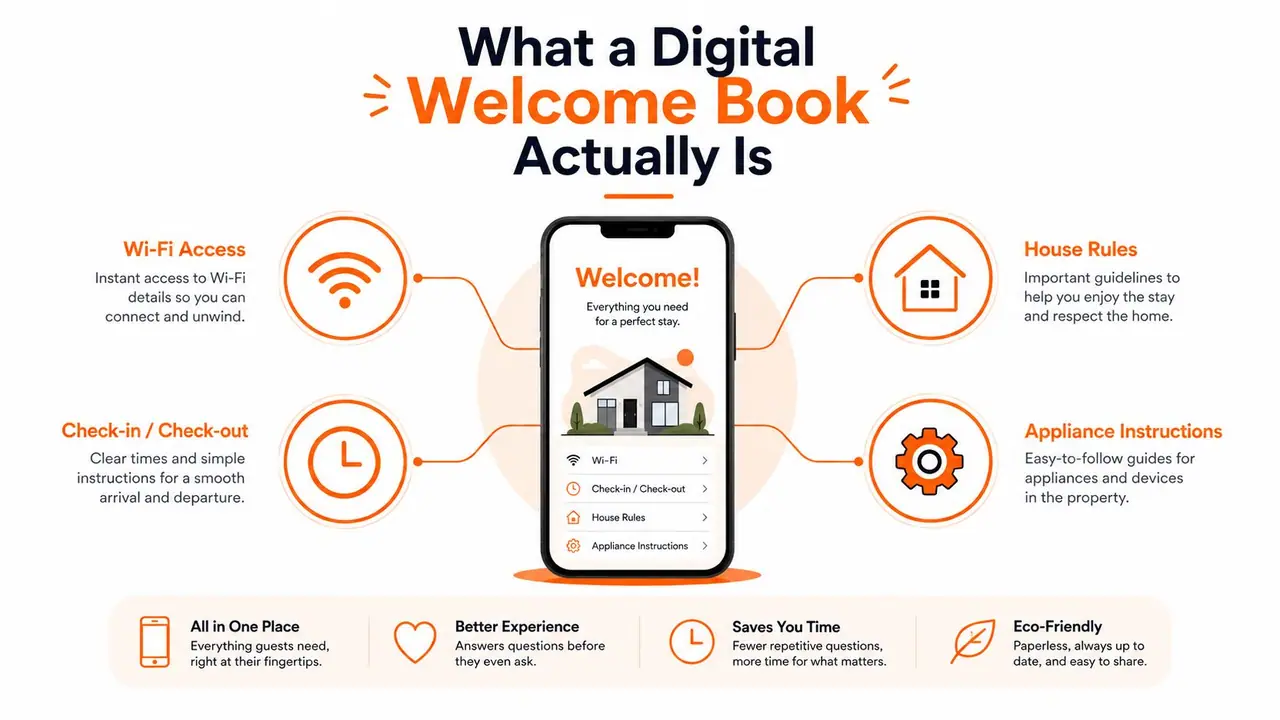
A digital welcome book is a mobile-first guest guide that lives online and opens instantly in a browser. It brings together the property details that matter most, like Wi‑Fi credentials, check-in and checkout steps, house rules, appliance instructions, safety notes, and local recommendations, in one always-updated link. It replaces the paper binder in the hallway with something guests can search, open on their phone, and use without waiting for a reply.
Why it beats a PDF or chat thread
A PDF sounds close, but it usually falls short. Guests have to download it, open it, and remember where they saved it. A chat thread is worse for anything beyond one-off questions, because the answer gets buried under cleaner messages, arrival updates, and small talk. The guide works best when it opens in any mobile browser without an app download, because that is the path of least resistance for a guest standing at the door with luggage.
The difference also shows up when details change. A static file becomes stale the moment you update a lock code or switch a router. A browser-based guide stays current because you update the source once and reuse the same link for future stays. That is why the format fits short-term rentals so well, it matches the way guests already use their phones for everything else.
The structure that gets used
Good guides do not try to cram every possible detail onto the first screen. They use progressive disclosure, which means the urgent items come first, then the rest is broken into short sections with bullets, photos, or simple steps. Expert guidance for this format puts the most time-sensitive items up front, then uses focused sections for appliances, systems, and property rules (Tioo).
Keep the opening screen short. Guests scan, they don't study.
That matters because the guide is not just a prettier version of your binder. It is a device-agnostic reference point that reduces friction at arrival and keeps the guest from searching your inbox for answers they should have had already. It also creates a clean place to present useful add-ons without making the stay feel pushy. A late checkout option, a transfer offer, or a paid upgrade lands better inside a guide guests are already using than in a scattered message thread.
The format also gives you a practical place to reuse material you have already written elsewhere. A host can pull in polished house notes, local tips, or onboarding text from a content repurposing guide instead of rewriting every touchpoint from scratch. That saves time, but only if the guide stays short enough that guests will open it in the first place.
The Real Benefits Beyond a Nicer Guest Experience
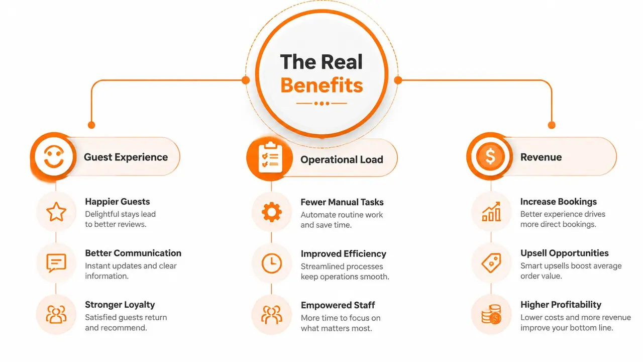
The visible benefit is a cleaner guest experience. The less visible one is that your operations stop getting interrupted for things guests could've solved themselves in under a minute. The third benefit is revenue, and most hosts underuse that side completely.
Guest experience that starts before the key handoff
Guests judge the stay early. A polished guide makes the property feel organized before they ever touch the thermostat or ask where the towels are. That first impression matters because it reduces uncertainty, and uncertainty is what drives avoidable support messages. A well-structured welcome book also helps guests feel like they're being looked after without you hovering over them.
Fewer repetitive messages and tighter boundaries
The operational win is straightforward. When Wi‑Fi, door codes, parking, checkout time, and appliance notes are in one place, you're no longer answering the same basic questions over and over. That gives you firmer boundaries around your evening, because the routine requests move out of chat and into the guide. It also makes it easier to keep responses consistent across co-hosts or team members, which matters more once a portfolio starts to grow.
Revenue, not just information
The part most guides miss is that a welcome book can do more than inform. It can point guests to restaurants on Google Maps, embed video how-tos for tricky appliances, and present one-tap offers for late checkout, airport transfers, or gear rentals. That turns a passive manual into a place where the guest can act immediately instead of messaging you first. If you're thinking about how to turn content into conversion, a practical content repurposing guide is surprisingly relevant, because the same idea applies here, one strong asset should do more than one job.
ScanStay's model fits that pattern directly, but the wider point is bigger than one product. A guide that answers questions and surfaces add-ons is doing two jobs at once, reducing labor and creating a cleaner path to extra revenue.
Must-Have Features That Separate a Real Guide From a PDF
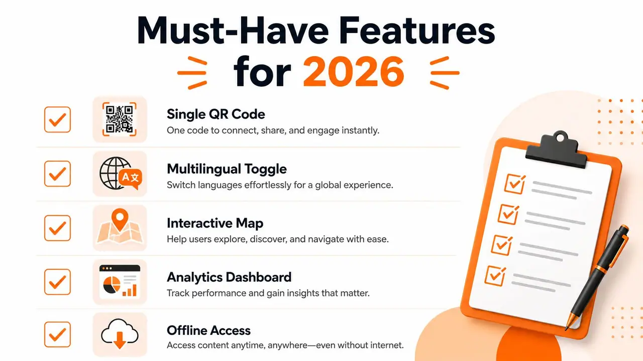
A real guide doesn't just look digital, it behaves like a living tool. If it still depends on downloads, manual file swaps, or messy formatting on a phone, it's not really solving the host problem.
Features that matter most
- Single QR code access. Guests scan once and open the guide in a browser.
- Mobile-first layout. The content has to read cleanly on a phone, not just on a desktop.
- Dynamic content blocks. Wi‑Fi, check-in, house rules, local recommendations, and upsells should be easy to update separately.
- Multilingual support. AI translation matters when guests don't share the same first language, but high-stakes content still needs review.
- Analytics. Scan counts and section engagement show what's being used and what's being ignored.
That checklist maps neatly to how a host works. The QR code gets the guide into the guest's hands. The content blocks let you update one section without rewriting everything else. Analytics tells you whether the guide is reducing confusion or just sitting there looking polished.
The features that save the most time
For tricky appliances, embeddable video helps more than a paragraph ever will. For recommendations, Google Maps pins remove the guesswork. For multi-property hosts, a dashboard that lets you reuse core sections across listings matters more than fancy design themes, because time gets lost when every property starts from zero. A printable A5 QR poster is also useful, because some guests will scan right away and others will only do it after they've dropped their bags.
If you want help turning short clips into useful property videos, the browse AI video creation tools resource from ClipNova is worth a look as a workflow reference, especially if you're building appliance walkthroughs or local guide clips at scale.
Rule of thumb: if the platform can't be updated centrally, it'll eventually become another stale file.
That's the difference between a guide that just exists and one that still works after the third turnover of the week.
Setting Up a Digital Welcome Book Step by Step
A host who wants this live does not need a long project. The first usable version can go out the same day if you stay focused on what guests need at arrival, and leave the polishing for later.
A realistic first build
Start with the account and give the property a clear name. Add the core sections in the order guests use them, Wi‑Fi, check-in, checkout, house rules, emergencies, then the local guide. That order works on a phone because it puts the urgent items first, which is where a digital welcome book does its best work.
Once the core content is in place, add a clean hero photo and a short welcome note. Then generate the QR code, print the poster, and test the link on your own phone before guests ever see it. Desktop previews miss problems that show up immediately on mobile, and mobile is where most guests will use the guide.
If you want a practical starting point for the structure, a digital welcome book template for short-term rentals can save time on the first build without forcing you into a rigid format.
What multi-property hosts should set up early
For hosts managing more than one property, reuse matters more than visual design. Build one strong version first, then duplicate it for the next listing and change only the details that are property-specific. Branded themes help the guide feel consistent, but the time savings come from keeping the same structure across every unit instead of rebuilding each page from scratch.
Pricing usually begins with free tiers and then moves into paid plans that commonly sit around $8 to $10 per property per month, with some multi-property pricing dropping to roughly $3 per property per month at 100 properties. That range gives a useful frame for the decision. You are not paying for decoration, you are weighing whether the guide saves enough admin time, reduces repetitive messages, and creates room for late checkout, transfer requests, or small upsells to justify the recurring cost.
A host can launch faster than expected by keeping the first version simple. Publish it, watch how guests use it, and improve the sections that get opened instead of trying to perfect every detail before the first stay.
Template Examples and What a Strong Structure Looks Like
A strong guide isn't long for the sake of being thorough. It's easy to skim, easy to update, and shaped around the guest's first few minutes in the property. The old hospitality best practice still holds here, the first page should show the Wi‑Fi network name and password, the property address, and urgent contact information (StayStrat).
A simple template and a revenue-aware version
| Section | Generic Template | Revenue-Aware Template |
|---|---|---|
| Cover | Welcome message | Welcome message plus property photo |
| Arrival | Wi‑Fi, address, check-in | Wi‑Fi, address, check-in, QR prompt |
| House rules | Basic rules list | Basic rules list with clearer enforcement notes |
| Appliances | Short text instructions | Text plus short video how-tos |
| Local guide | Restaurant list | Google Maps pins, neighborhood tips, transport notes |
| Checkout | Departure checklist | Departure checklist plus late checkout offer |
| End of stay | None | Review request and repeat-stay reminder |
The generic version is enough to get started. The revenue-aware version adds places where the guest can take action without needing to message you first. That's where the guide starts behaving like a business tool instead of a digital binder.
What not to do
The common mistake is overstuffing the guide. If every restaurant, every rule, every appliance quirk, and every possible FAQ lands in one giant wall of text, guests stop scanning. That's why a quarterly content review at minimum matters, not just for accuracy, but for trimming what no longer helps.
For a ready-made structure you can adapt, this vacation rental welcome book template gives a useful reference point for the order and section logic. Use it as a skeleton, then cut anything that doesn't help a guest act quickly.
The best structure is the one a tired guest can understand at 10:30 p.m. without messaging you.
Best Practices for Multilingual Support, QR Placement, and Analytics
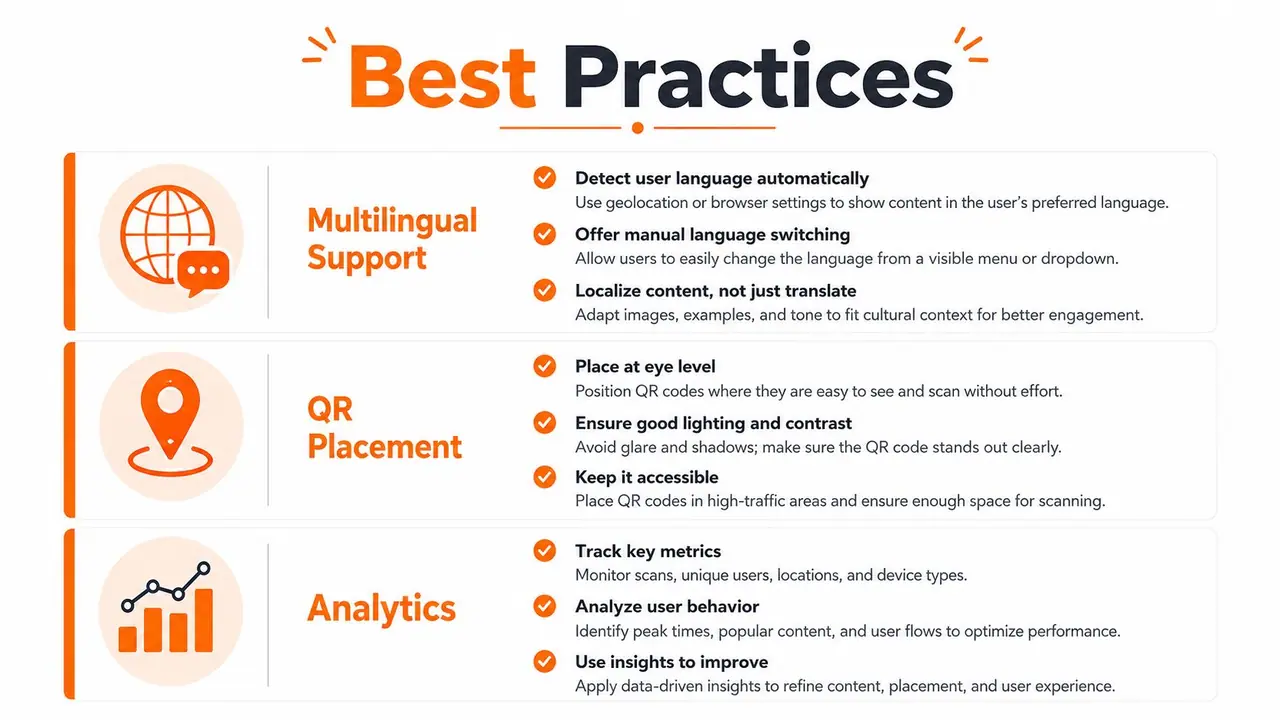
The guide works only if guests can find it, understand it, and use it. That comes down to three operating habits, not three marketing features.
Multilingual support that protects meaning
International guests need more than a rough translation. AI translation across many languages helps, and ScanStay supports 18 languages with AI translation, but high-stakes items like evacuation steps, appliance safety, and house rules still deserve human review. Translation quality matters most where a misunderstanding could turn into a safety issue or a house-rule conflict.
Concise language helps too. Short sentences, clear labels, and visual cues do more for comprehension than elaborate copy. If a sentence would be awkward when translated, simplify it before you worry about styling.
QR placement that matches real guest behavior
Guests scan where they naturally stop. The kitchen counter works because people set bags down there. The entryway works because they look for immediate arrival instructions. The bedside table and the inside of the apartment door also earn their keep, because guests notice them when they're settling in or leaving. A printable QR poster gives you a fallback for the guest who doesn't want to scan until later, or who missed the code on arrival.
For setup help, this QR code generator guide is a useful reference if you're deciding how to format and place the code on property materials.
Analytics should drive your content review
Scan counts and section-level engagement are the clearest signals you have about what guests still can't find on their own. If the checkout page gets little attention but the Wi‑Fi section gets hit constantly, that tells you something about layout or clarity. If the same section keeps getting opened, that's a sign the wording may need to be shorter, more visual, or easier to locate.
The most valuable feature isn't more content, it's fewer ambiguities.
That's the practical edge. Clear, standardized instructions and visible fallback paths do more for guest confidence than a bloated guide ever will.
Choosing and Implementing the Right Digital Welcome Book
The right choice starts with the checklist, not the brand page. A host should decide whether the platform opens instantly in mobile browsers, supports reuse across properties, offers enough language coverage for the guest mix, and gives analytics that are detailed enough to change the content, not just admire it. Free tiers can work for one property and a simple setup, but once a portfolio grows or the guide starts carrying upsells, paid plans usually make more sense because the workflow matters more than the sticker price.
A useful test is whether the platform helps you do five things without friction. Publish the guide. Reuse the content for another property. Update a section centrally. Print a QR poster for on-site use. See what guests opened. If any of those steps feel clunky, the tool will become a maintenance task instead of a time saver.
A platform like ScanStay fits that decision framework because it combines QR access, 18-language AI translation, a printable A5 QR poster, multi-property reuse from a central dashboard, and one-tap blocks for extras such as late checkout and transfers. That combination matters because it connects the guest's first question, the host's operational load, and the revenue opportunity in one place. If you're comparing tools, that's the standard to measure against, not how polished the homepage looks.
It's also smart to check whether your guest journey needs adjacent features outside the guide itself. For example, if you sell extras or collect payments for add-ons, a practical read on crypto checkout for web apps can help you think through payment flow design, even if your current setup stays with traditional card processing. The point is to build a guest experience that feels simple at the front end and manageable at the back end.
Your first-week checklist should be short. Publish the guide. Print and place the QR poster. Test the link on a guest's phone, not just yours. Review the first week's analytics. Then adjust the upsell block based on what guests click, not what you hoped they'd want.
If you want to replace repeat messages with a guide that works in the guest's browser and still leaves room for upsells, ScanStay is built for exactly that flow. Visit ScanStay to see how a QR-based digital welcome book can centralize guest info, support multilingual stays, and turn routine check-in questions into a cleaner, more profitable system.