WCAG Accessibility Standards for Short-Term Rental Hosts
Learn how WCAG accessibility standards apply to digital guest guides. Practical checklist for short-term rental hosts to improve contrast, text, forms
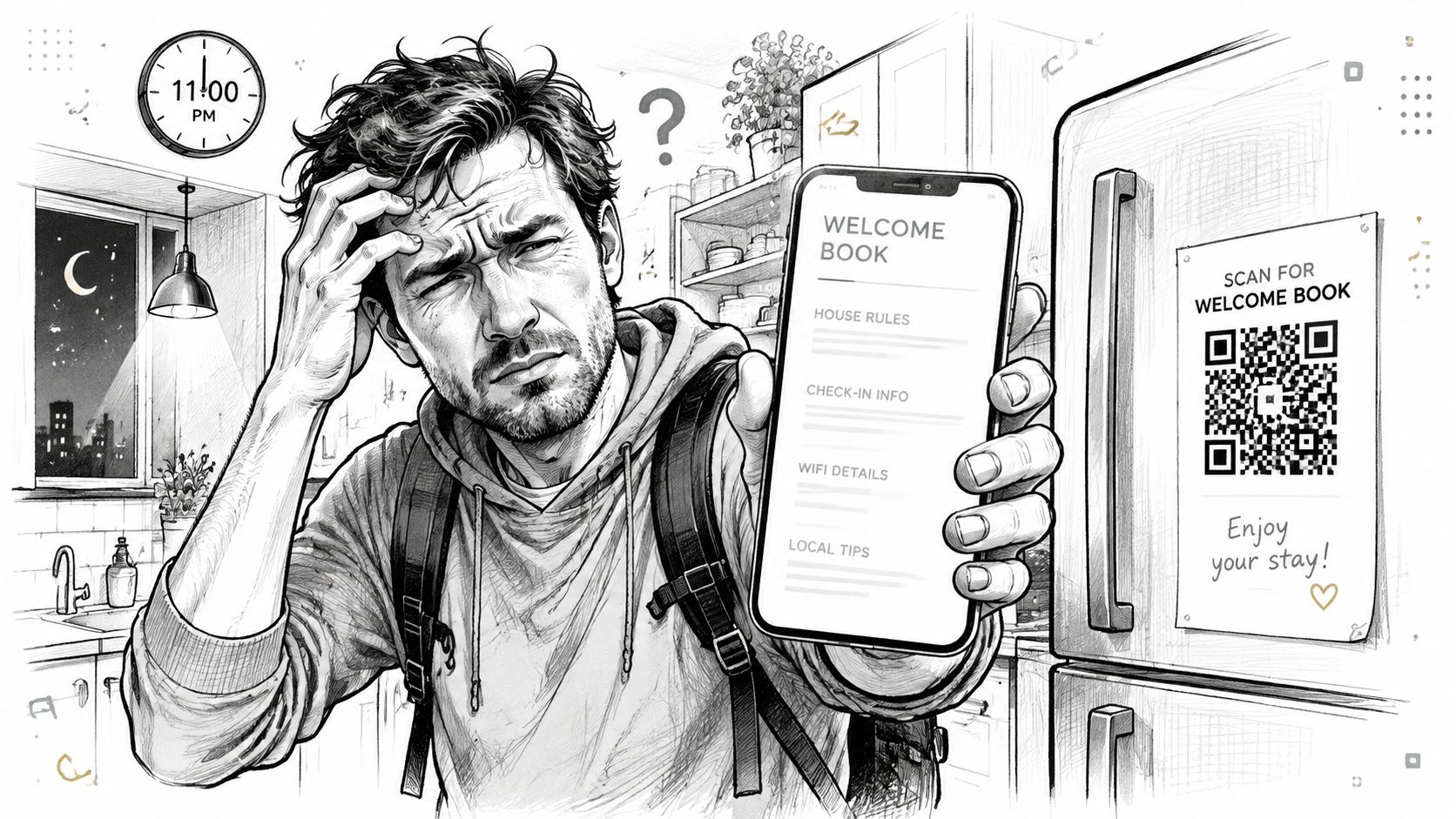
A guest arrives at 11 p.m., tired from travel, and scans the QR code on the refrigerator. The welcome book opens, but the text is pale gray on white. The Wi-Fi details exist only inside an image without alternative text. A hot-tub video starts without captions, and the check-out instructions are buried beneath several promotional sections. The guest can't adjust the thermostat, find the parking details, or understand what to do next.
That experience can frustrate any traveler, but it creates a much higher barrier for guests with low vision, motor impairments, hearing loss, cognitive disabilities, or limited attention after a long journey. A digital guide isn't just a collection of property information. On many stays, it's the guest's main interface with the host, the building, and the surrounding area.
WCAG accessibility standards provide a practical framework for removing those barriers. The challenge for short-term rental operators isn't memorizing a generic compliance checklist. It's translating accessibility requirements into fast, understandable task completion on a phone, often in poor lighting, across languages, browsers, and devices. A guest should be able to find Wi-Fi, enter the property, report a problem, and check out without asking for help.
Table of Contents
- Why Accessibility Matters for Digital Guest Guides
- Understanding WCAG Principles and Conformance Levels
- The Most Common Accessibility Failures and What They Mean for Hosts
- Accessibility Checklist for Short-Term Rental Digital Guides
- Testing Tools and Methods That Actually Work
- Legal and Business Implications of Accessible Guest Experiences
- Quick Remediation Tips and Next Steps for Hosts
Why Accessibility Matters for Digital Guest Guides
The paper binder on the coffee table had obvious limits, but at least guests could usually flip through it, enlarge what they needed, and ask the host to explain unclear instructions. A QR-based guide replaces that binder with a mobile browser experience. That makes updates easier, but it also means a poorly designed page can become the first obstacle a guest encounters.
A host may think the problem is a small font or an unlabeled icon. For the guest, the result is more serious. A screen reader may not identify a button, a person with low vision may lose light-gray text against a white background, and someone using a phone keyboard or switch control may be unable to reach the next page. Travel fatigue increases the effect of every unnecessary decision.
The guide is part of the stay
Guests don't experience accessibility as a legal category. They experience it as, “Can I complete this task?” A useful guide answers the highest-pressure questions first:
- Access: Where is the entrance, and how do I open it?
- Connectivity: What is the Wi-Fi network and password?
- Comfort: How do I operate the heating, cooling, hot water, or appliances?
- Safety: What should I do if there is an emergency?
- Departure: What exactly must I do before leaving?
Those answers need clear text, descriptive links, sensible headings, and alternatives for visual or audio content. A digital welcome book can reduce repeated questions, but only when the mobile experience works for the full range of guests who may open it.
Accessibility also protects the quality of the stay. A guest who can't find the check-out process may message the host late at night. A traveler who can't interpret an image-only Wi-Fi instruction may assume the internet is unavailable. A visitor who misses an important house rule because the text is difficult to read may appear careless when the guide created the confusion.
Practical rule: Design every guide page around one completed guest task, not around everything the host wants to say.
WCAG gives hosts a way to test whether those tasks are available through more than one mode of interaction. It turns “the guide looks fine on my phone” into specific questions about contrast, labels, keyboard access, structure, and compatibility.
Understanding WCAG Principles and Conformance Levels
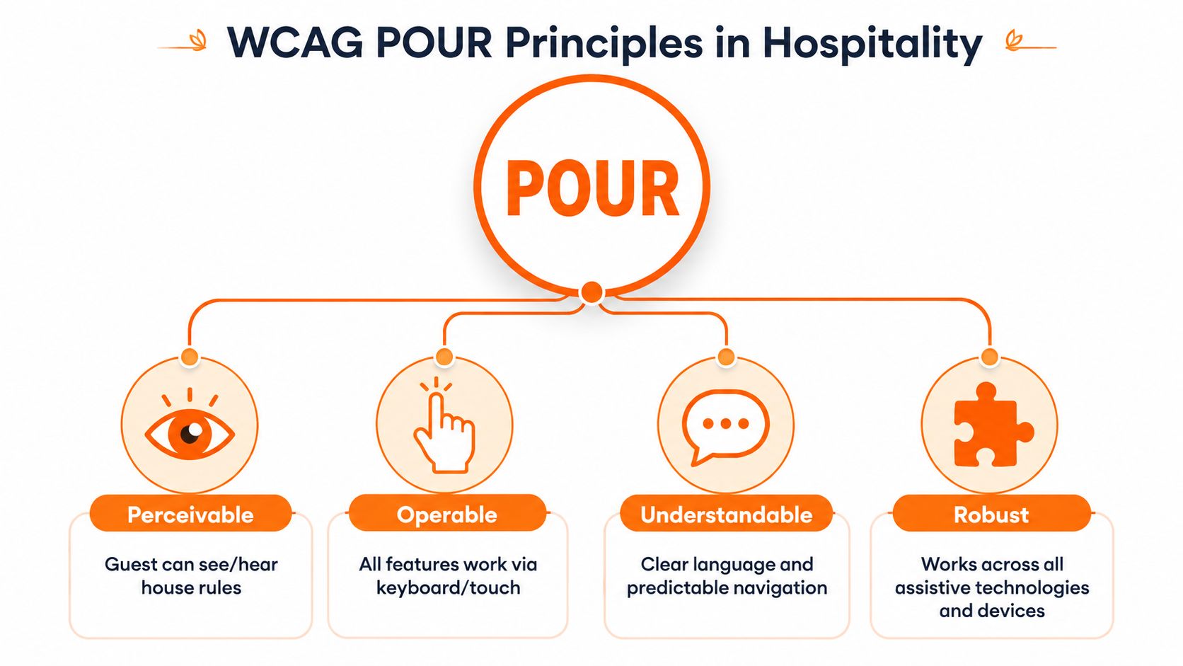
WCAG is organized around four principles, known as POUR. For a hospitality operator, these principles provide a practical way to inspect whether a guest can complete key tasks on a phone, with different languages, browsers, and assistive technologies.
Perceivable information
Guests must be able to receive information in a form they can perceive. A photo of a fuse box can help a sighted traveler, but it does not replace written directions. A video showing an induction hob needs captions or a text alternative for guests who cannot hear it.
Perceivable design also covers readable contrast, text that can be enlarged without losing meaning, and alternatives for non-text content. If an emergency exit map contains the only route information, add an equivalent text description. If the Wi-Fi password appears in a branded image, repeat it as selectable text beside the image. This matters on QR-based guides, where guests may open one page outdoors, in a dim room, or through a translated browser.
Operable controls and navigation
An operable guide lets guests move through content and activate controls without depending on a mouse or one precise touch gesture. A menu that cannot be reached by keyboard, a carousel that traps focus, or a button identified only by an icon can stop a simple task before it starts.
Touch is only one input method. Guests may use screen readers, external keyboards, voice control, magnification, or alternative devices. Give each important action a clear name and a predictable focus order. On mobile, keep controls easy to identify and activate, especially for check-in instructions, door access, and emergency information.
Understandable content
Understandability begins with language. “Ensure all refuse is appropriately segregated in accordance with municipal waste protocols” is harder to follow than “Put recycling in the blue bin beside the kitchen door.”
Use short instructions, familiar verbs, consistent labels, and stable navigation. “Wi-Fi,” “Check-in,” and “Check-out” should mean the same thing wherever they appear, including translated versions. Avoid switching between synonyms that may confuse guests using machine translation or screen readers. Error messages should state what went wrong and how to correct it, particularly in maintenance or feedback forms.
A multilingual guide also needs the same task structure in every language. Translating a heading while leaving the button label or linked document in another language creates friction at the point of action.
Compatibility and future-proofing
Content should continue working across browsers, operating systems, screen sizes, and assistive technologies. A guide that looks correct on a current iPhone but breaks on an older Android browser is not ready for real property operations. Test the QR destination in more than one mobile browser, and confirm that text, buttons, language controls, and embedded media remain usable.
WCAG was published by the W3C as WCAG 2.0 on 11 December 2008, and it later became ISO/IEC 40500:2012, approved on 15 October 2012. That history helped establish WCAG as a recognized standard for procurement, policy, and compliance programs, as described in the W3C overview of WCAG standards.
Choosing a conformance target
WCAG conformance is based on testable success criteria at Level A, AA, or AAA, rather than on using recommended techniques alone. The WCAG 2.1 specification sets out this criteria-based structure, which supports verification in contracts, procurement, and compliance work.
Level A addresses basic barriers that can make a page unusable. Level AA covers common barriers and is the practical priority for many mobile guest guides. Level AAA contains more demanding criteria and is not a realistic blanket target for every property operation.
WCAG 2.1 became a W3C Recommendation on 5 June 2018. WCAG 2.2 followed on 5 October 2023, adding 9 success criteria while keeping earlier requirements largely intact, according to the U.S. Access Board's WCAG 2.2 update. For hosts, a practical Level AA baseline, followed by a review of newer WCAG 2.2 criteria, provides a clearer target than claiming perfection.
The Most Common Accessibility Failures and What They Mean for Hosts
A guest scans the QR code outside the property, opens the guide on a phone, and finds the lockbox instructions in pale text over a bright image. Another guest reaches the Wi-Fi password, but it appears only inside a photo. These failures are easy to overlook in a design review and disruptive during arrival.
The WebAIM Million study found detectable WCAG failures on 95.9% of home pages in its 2026 analysis. Six issues accounted for 96% of detected errors, including low-contrast text at 83.9%, missing alternative text at 53.1%, and missing form labels at 51%. Those results concern home pages, not rental guides, so they are not a direct measure of host performance. They do show why basic checks should come before visual polish.
| WCAG Failure | Guest Guide Example | Guest Impact | Fix Complexity |
|---|---|---|---|
| Low text contrast | Light gray check-in instructions over a white card | Directions become difficult to read in dim rooms or bright outdoor light | Low |
| Missing alternative text | Wi-Fi password or floor plan shown only as an image | Screen-reader users receive no useful information | Low |
| Empty or unclear links | An unlabeled icon opens the house manual | Guests cannot identify the destination or may tap the wrong control | Low to medium |
| Missing form labels | A maintenance form uses placeholder text instead of labels | Guests may not know where to enter their name, room, or problem | Medium |
| Inaccessible video | Appliance tutorial has speech but no captions | Deaf or hard-of-hearing guests miss operating instructions | Medium |
| Poor heading structure | Every section uses large bold text instead of semantic headings | Screen-reader users cannot scan the guide efficiently | Medium |
Why these errors become operational problems
Contrast affects task completion. A guest reading arrival directions in sunlight, glare, or a dim hallway may miss the instruction that identifies the entrance, keypad, or parking space. Use text that remains readable on a small screen, then verify it on the live mobile page rather than trusting the editor preview.
Alternative text matters when an image carries operational information. A photo containing the Wi-Fi password, floor plan, or appliance control leaves screen-reader users without the answer unless the same information appears as selectable text. The fix is usually straightforward: provide the instruction in HTML and describe an image's function where the image adds orientation.
Controls need names that remain clear after translation and on touch screens. An unlabeled icon may open the house manual for one guest and the wrong page for another. A screen reader may announce only “button,” while a narrow mobile layout can make adjacent icons difficult to distinguish. Use visible labels where space allows, accessible names for icon controls, and enough separation to prevent accidental taps.
Forms fail when placeholder text stands in for labels. Once a guest starts typing, the prompt disappears, creating uncertainty about fields such as name, room, or maintenance issue. Persistent labels and clear error messages reduce follow-up questions.
Video and structure create another gap. Captions let guests follow an appliance tutorial without sound, while semantic headings let screen-reader users scan a long guide instead of listening from the beginning. A guide can look polished and still bury the tasks guests need.
Test each task without sight, sound, precise touch, or a fast connection. Automated scanners can expose code-level issues, but a manual mobile task test shows whether a tired traveler can find, understand, and complete the instruction.
Accessibility Checklist for Short-Term Rental Digital Guides
A good guide should survive the conditions in which guests use it. They may scan the QR code outdoors, hold the phone in one hand, zoom the page, switch languages, or rely on a screen reader. Run the following checks against the live mobile experience, not only the editor preview.
Start with visual readability
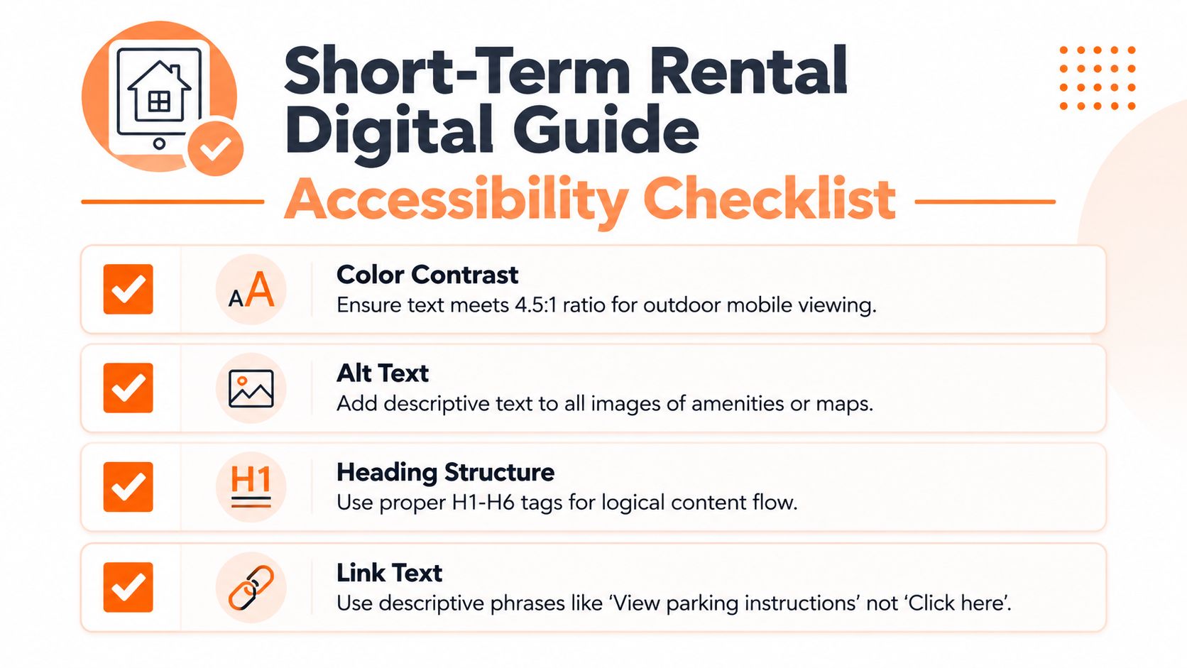
Use strong contrast for body text and instructions. WCAG's commonly used contrast thresholds are 4.5:1 for regular text and 3:1 for large text, but the source for those requirements should be checked directly in the applicable WCAG success criteria. Don't place essential instructions over busy property photography unless the text has a solid background or another reliable treatment.
Choose a readable typeface that renders consistently in iOS and Android browsers. Keep body copy comfortably sized, use generous line spacing, and avoid justified paragraphs, which can create uneven gaps and make short instructions harder to scan. Test the guide in bright daylight and a dark room, because a color combination that passes in a design tool may still feel weak in practice.
Make images carry useful information
Alt text should describe the function of an image, not merely identify the object. “Kitchen” adds little value. “The Wi-Fi router sits on the shelf beside the television” gives a guest useful orientation.
For property photos, describe details that affect a task or decision. A floor plan should have a text alternative listing the relevant rooms and route. Decorative images can use empty alternative text so assistive technology skips them. Never place the only access code, password, emergency instruction, or appliance control inside an image.
Structure pages for scanning
Use one clear page title, then logical headings for sections such as Wi-Fi, Entry, Heating, and Check-out. Don't create headings by enlarging ordinary text manually, because assistive technologies depend on the document structure to understand the layout.
Links should explain their destination. “View parking instructions” is better than “Click here,” and “Open the appliance guide” is better than an unlabeled arrow. Keep the most time-sensitive content near the top of the page, especially entry, Wi-Fi, and emergency information.
Treat video as supplementary content
Captions should include spoken instructions and meaningful audio cues. Auto-generated captions can help with a first draft, but property names, appliance terminology, and accents often need correction. Add a written transcript or concise step list so guests aren't forced to watch a video to complete a basic task.
The embedded video below can supplement a written checklist, but it shouldn't be the only way a guest learns how to use an appliance.
Check forms, language, and direction
Every form field needs a visible, programmatic label. “Describe the issue” should remain available as a label even after the guest starts typing. Errors should identify the field and explain the correction.
Language switching needs an accessible name, keyboard support, and a clear indication of the current language. Translations should preserve headings, link purpose, and error messages rather than translating only the main paragraphs. If you serve guests who read right-to-left languages, check that alignment, menus, icons, and directional instructions remain meaningful. Practical guidance on planning multilingual guest content is available in this guide to multi-language support.
Testing Tools and Methods That Actually Work
No single scanner can tell you whether a guest can complete a check-in flow. Automated tools are useful for finding repeatable technical defects, but they won't reliably judge whether a translation is understandable, whether a page is too long, or whether a photo obscures a critical instruction.
Match the tool to the question
| Tool or Method | Cost | Ease of Use | Best For | Limitations |
|---|---|---|---|---|
| WAVE | Free browser access available | Easy | Visible page-level issues and heading review | Doesn't replace task testing or full mobile review |
| axe DevTools | Free and paid options | Moderate | Developer-oriented rule checking | Dynamic states and content still need manual coverage |
| Lighthouse | Built into common browser workflows | Easy | Quick baseline checks during page review | Accessibility scores don't represent complete conformance |
| VoiceOver | Included on Apple devices | Moderate | Testing iPhone navigation and announcements | Requires practice with rotor and gestures |
| TalkBack | Included on Android devices | Moderate | Android screen-reader task flows | Results vary with browser and device settings |
| WebAIM Contrast Checker | Free | Easy | Checking text and background combinations | Static checks don't capture every image overlay state |
| Stark | Free and paid options | Easy to moderate | Design-stage contrast and color review | Design previews may differ from the live page |
| Keyboard and zoom testing | No additional tool required | Easy | Focus order, resizing, and operability | Needs a deliberate script and repeated practice |
Run WAVE, axe DevTools, or Lighthouse against the live guide and record every issue by page and task. Resolve repeated template defects first. If the same unlabeled button appears on every property page, fixing the template is more valuable than editing one listing at a time.
A five-minute mobile screen-reader test
Open the guide in Safari with VoiceOver or in Chrome on Android with TalkBack. Start at the top and listen to the page title, headings, links, buttons, and form labels. Then attempt four tasks without looking at the screen:
- Find the Wi-Fi instructions.
- Open the check-in directions.
- Start an appliance video and identify its text alternative.
- Submit a simple maintenance request.
If the screen reader announces an unlabeled control, skips the main content, repeats irrelevant elements, or gives no confirmation after form submission, the guide needs structural work. Test keyboard navigation separately by using Tab and Enter, checking that focus remains visible and never becomes trapped.
A useful test is task-based: “Can a guest find the door code?” tells you more than a clean-looking dashboard report.
Zoom the page substantially and rotate the phone if the content supports it. Look for clipped text, horizontal scrolling, overlapping buttons, and menus that close before a guest can select an option. Test gradients and image overlays with a contrast checker, because a color may pass over one part of a photo and fail over another.
For most hosts, a sensible cadence is automated review during regular content updates, manual spot checks after template changes, and a broader audit after a major redesign. The important part is assigning ownership. A scan that nobody records or fixes is only a notification.
Legal and Business Implications of Accessible Guest Experiences
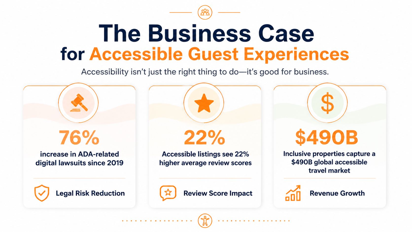
Accessibility has a legal dimension, but hosts shouldn't reduce it to lawsuit avoidance. WCAG's testable criteria help an operator document what was checked, what failed, and what was corrected. That record can support procurement conversations, internal standards, and discussions with legal or accessibility professionals.
Requirements vary by country, business structure, platform, and the service being offered. ADA Title III and international accessibility frameworks may affect digital hospitality experiences, but a host shouldn't assume that meeting a visual checklist settles legal responsibility. Get jurisdiction-specific advice when a property portfolio, hotel operation, public-facing service, or complaint creates meaningful legal exposure.
The business argument is more immediate. A guest guide that hides essential information creates messages, delays, avoidable mistakes, and reviews about confusion. Accessible content also improves the experience for people who don't identify as disabled, including guests using phones in glare, travelers with limited language fluency, older visitors, and families coordinating several people around one device.
Accessibility strengthens operational consistency
A clear, text-first guide gives co-hosts and cleaners a dependable reference for updating instructions. It also helps guests complete tasks without waiting for a reply. That matters particularly in portfolios where one template is reused across properties, because a defect in the template can affect every location.
Inclusive content can support trust with corporate travelers, multigenerational families, and guests who need to evaluate access before booking. Hosts shouldn't promise features a property doesn't have. They should describe the digital guide and physical accommodation accurately, including limitations, routes, stairs, controls, and available support.
Documentation makes the work sustainable. A compliance documentation workflow can help organize page inventories, test results, ownership, and remediation dates. It won't replace legal advice or user testing, but it gives the team a repeatable way to manage accessibility instead of treating each complaint as a one-off emergency.
Avoid unsupported marketing claims such as “fully accessible” or “WCAG compliant” unless the claim has been properly evaluated and defined. A more credible approach is to state which accessibility features are present, which tasks were tested, and how guests can request assistance.
Quick Remediation Tips and Next Steps for Hosts
Start with the fixes that remove the most friction from the arrival experience. Put Wi-Fi, entry, emergency information, and check-out where guests can find them quickly. Replace image-only instructions with real text, increase weak contrast, label every control, and make the most important links describe their destinations.
The first few hours
Before the next check-in, open the guide on the phones your team uses. Check the first screen, the main menu, Wi-Fi details, lockbox instructions, and check-out page. Read every instruction aloud and ask whether a guest could complete the task without seeing a photo, hearing a video, or guessing what an icon means.
Correct the content before redesigning the branding. A plain text instruction that works is more valuable than a polished card that fails in a screen reader. Confirm that passwords, access codes, and emergency directions are selectable text and available in every published language.
The first month
During the next content cycle, fix the underlying template rather than making isolated page edits. Create a consistent heading hierarchy, standardize button labels, add captions and written alternatives to videos, and test forms with keyboard and screen-reader navigation.
Review reused content across properties. A copied page can carry the same missing label, poor contrast, or misleading instruction into every listing. Keep a simple issue log with the page, task, problem, owner, and resolution so future edits don't reintroduce the defect.
The ongoing routine
Accessibility needs to become part of publishing. Scan new pages, test the highest-frequency guest tasks on mobile, and repeat the review after changing a template, translation, navigation pattern, or embedded media element.
The practical target isn't a guide that wins a one-time audit. It's a guide that remains usable when a guest arrives late, uses a different phone, switches languages, enlarges text, or relies on assistive technology. That standard improves hospitality because it measures success by completed tasks rather than visual polish.
ScanStay lets hosts replace paper binders and repetitive messages with a QR-accessed digital welcome book containing Wi-Fi details, check-in and check-out instructions, house rules, local recommendations, and video how-tos in a mobile browser. Visit ScanStay to see how its multilingual guest-guide workflow can support clearer, more accessible property information.