QR Code Poster Design for Short-Term Rentals
Learn QR code poster design for Airbnb and rental hosts. Covers sizing, contrast, error correction, branding, and testing for reliable guest scanning.
A guest arrives after dark, carrying luggage in one hand and a phone in the other. The porch light is dim, the door poster is behind reflective glass, and the QR code is smaller than the guest expects. After several failed attempts, the guest messages you for the Wi-Fi details or check-in instructions you thought were already available.
That failure usually starts before the poster reaches the property. The code may be too small for the viewing distance, the background may weaken contrast, or the design may give guests no reason to scan. Good QR code poster design treats the sign as an operational tool, not a decorative printout. Every choice, from the A5 layout to the final on-site test, should help a tired guest understand, aim, scan, and reach the right information without assistance.
Table of Contents
- Why Most Rental QR Posters Fail at the Front Door
- Sizing, Dimensions, and the A5 Printable Format
- Contrast, Color, and Error Correction That Actually Work
- Branding, Messaging, and the Call to Action
- Dynamic Codes, UTM Tracking, and Scan Analytics
- Placement, Accessibility, and On-Site Scan Testing
- Pre-Print Checklist and Final Review
Why Most Rental QR Posters Fail at the Front Door
The most common mistake is designing from the screen instead of the entrance. A QR code can look crisp and generous inside Canva, Adobe Express, or a phone preview, then become difficult to scan after it's printed, mounted high, viewed at an angle, and exposed to uneven lighting.
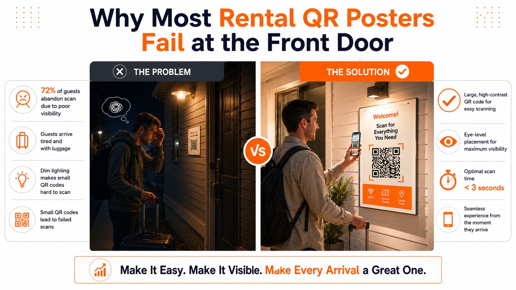
I've seen the same failures across rental entrances: a code reduced to fit beside a large property logo, a decorative gradient placed behind the modules, a logo covering the quiet zone, and a poster positioned directly against glass. Each choice may appear harmless on its own. Together, they leave the phone camera with too little clean information to recognize the symbol reliably.
Practical rule: Design for the guest's least convenient scan, not your easiest one.
A missing call to action creates a different problem. Guests may not know whether the code opens Wi-Fi, house rules, check-out instructions, or a local guide. “Scan here” gives them an instruction but no benefit. A short message such as “Scan for Wi-Fi and house rules” removes that uncertainty and makes the poster useful before the camera opens.
The cost of failure is practical. Guests may send repeated questions, miss check-in details, overlook house instructions, or begin their stay frustrated. A reliable poster reduces those avoidable interruptions, but reliability starts with physical dimensions. Measure the likely scan distance first, then build the poster around the code instead of squeezing the code into whatever space remains.
Sizing, Dimensions, and the A5 Printable Format
At a rental entrance, the right QR size depends on where guests stop, not where the poster hangs. Use the 10:1 viewing-distance rule as a starting calculation: the code should be about one-tenth as wide as the distance to the poster. A guest standing roughly one metre away needs a code approximately ten centimetres wide. Print the design and test it from the actual approach point before finalizing it.
A5 suits many rental doors because its 148 by 210 millimetre page leaves space for a headline, a direct instruction, and an isolated QR code. It also works with common A4 home-printing workflows and standard sign holders. Follow a practical A5 poster printing workflow so the exported file, paper setup, and trimming stay consistent. The paper size alone does not guarantee a readable code. Reserve room for the modules, quiet zone, and surrounding space.
| Placement | Expected Viewing Distance | Minimum Code Size | Recommended Poster Format |
|---|---|---|---|
| Wall or entrance sign | 1–2 m | 10–20 cm | A5 or larger, depending on the approach distance |
| Door reading point | About 1 m | About 10 cm | A5 portrait |
| Table tent or fridge | About 20–50 cm | About 2–5 cm | Small card or compact tabletop format |
The 10–20 cm guidance for 1–2 m viewing distances is also reflected in Adobe Express QR code design guidance. A poster beside the lock can use a closer viewing distance. One across an entrance hall needs a larger code while guests are still approaching.
Sketch the layout before opening a design tool:
- Code zone: Give the QR symbol the largest uninterrupted area.
- Quiet zone: Keep at least four module widths clear on every side, as recommended in QR code best-practice guidance.
- Message zone: Put the headline and call to action outside the quiet zone, with a visible gap from the code.
- Print zone: Keep important text away from the trim edge and leave a safe outer margin.
Use a dark code on a light background and aim for at least a 4:1 contrast ratio, following the measurable design guidance in the QR poster statistics reference. A5 performs well at the door only when the code remains the visual priority and the printed result scans from the guest's real stopping distance.
Contrast, Color, and Error Correction That Actually Work
Color customization fails when branding takes priority over camera recognition. A pale gray code on white, a pastel background, or a transparent PNG placed over a photograph may look refined, but the modules can disappear under real entryway lighting. Start with a dark foreground and a light, untextured background.
QR codes offer four error-correction levels. Their approximate recovery capacities are 7% for L, 15% for M, 25% for Q, and 30% for H, as outlined in QR code error-correction guidance.
| Level | Recovery % | Best Use Case |
|---|---|---|
| L | Approximately 7% | Plain code with excellent print conditions |
| M | Approximately 15% | Plain code without a logo overlay |
| Q | Approximately 25% | Branded code with a modest centered logo |
| H | Approximately 30% | More demanding branding or larger logo treatment |
For a plain rental poster, M is often a sensible starting point. For a branded code with a centered logo, Q provides more recovery capacity. H is the safer choice when the logo is prominent or the poster will face dust, wear, or less controlled conditions. Higher correction doesn't excuse poor sizing or contrast. It gives the code more resilience, not permission to cover its structure.
Strong color pairs include navy on white, dark green on cream, and black on light yellow. Test the actual exported artwork, not just the colors inside the editor. Aim for at least 4:1 contrast, while OpenQR's practical guidance notes that some print contexts recommend around 70% print contrast for more reliable results across paper and lighting variation.
Avoid inverted codes, multitone modules, busy photography, and brand colors that only look dark on a bright monitor. If you're preparing supporting collateral, the same restraint applies to items such as cards that attract pet owners. Brand consistency should support recognition, not compete with the action you need the guest to take. For a broader implementation reference, use QR code best practices for rental posters.
Branding, Messaging, and the Call to Action
At the front door, guests may be carrying bags, checking the lock, reading the property name, or confirming the address. Your poster must communicate under that distraction. A strong layout removes decisions and directs attention to one clear action.
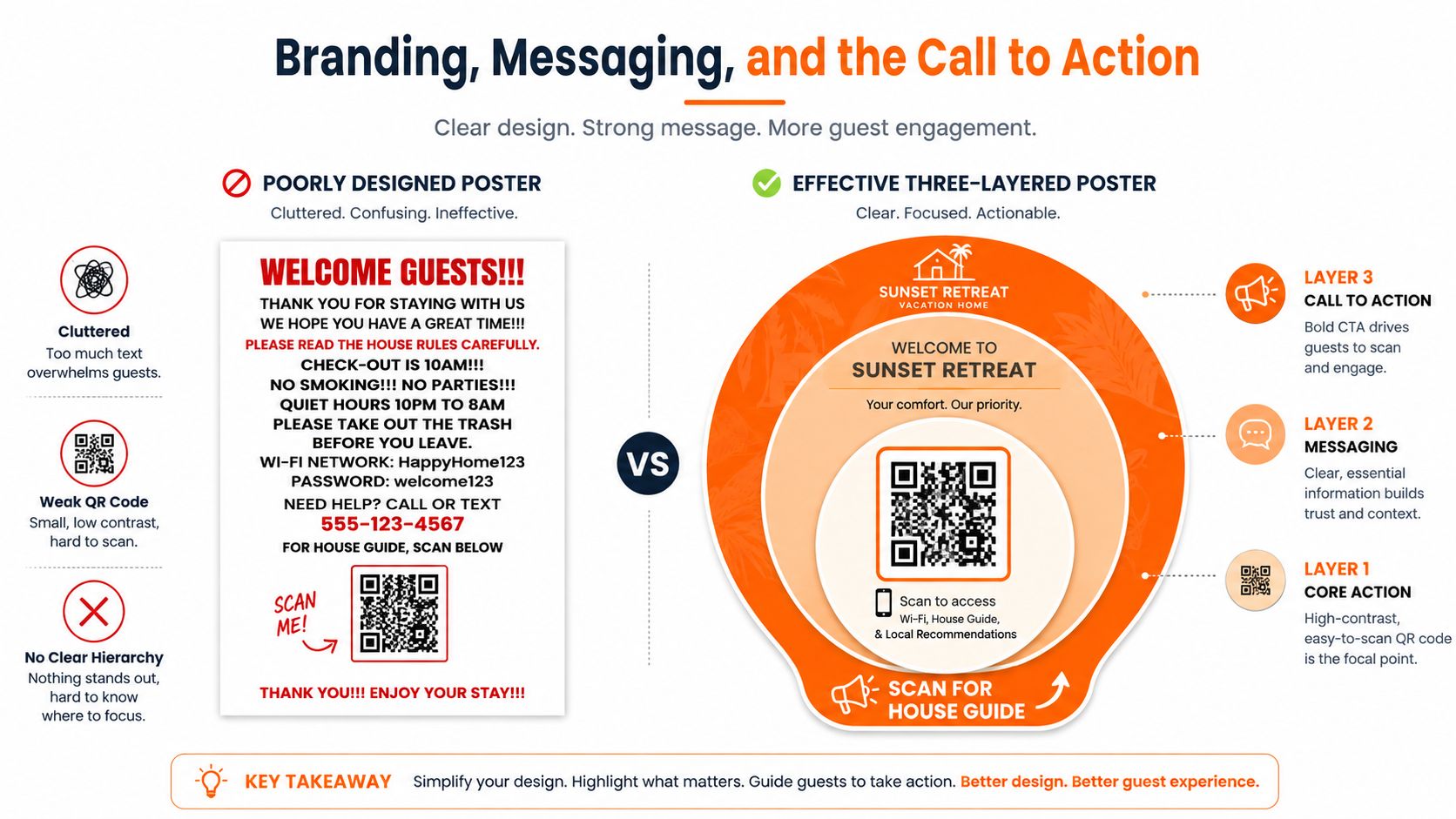
Build the design in three layers:
- The code: Make it the largest functional element, with clean space around it.
- The destination: Use a short headline of roughly four to seven words, such as “Wi-Fi, Check-out, Local Guide.”
- The action: Place a direct instruction above or beside the code, such as “Scan for Wi-Fi and house rules.”
“Scan here” gives the guest no reason to act. “Scan for Wi-Fi and house rules” states the benefit. “Scan to view the local guide” suits a recommendations page. Use a verb, identify the reward, and remove guesswork.
Reserve at least 60% of the layout for the code and its surrounding white space when scanning is the poster's primary job. The property logo, welcome message, and decorative elements should support the scan rather than force the code into a corner.
Headline formulas that work
A small set of formulas covers most rental use cases:
- Destination list: “Wi-Fi, House Rules, Check-out”
- Immediate benefit: “Everything You Need for Your Stay”
- Location cue: “Your [Property Name] Guest Guide”
- Task-specific prompt: “Scan for Door and Wi-Fi Help”
Keep logos, social handles, icons, and promotional copy outside the quiet zone. A logo can sit above the headline or near the footer. It should not overlap the modules or touch the code's protective margin. On an A5 poster, every extra element competes with the code, so remove decoration before shrinking the scan area.
File format affects whether the layout survives printing. SVG, PDF, and EPS preserve vector edges, keeping square modules sharp at the final size. PNG or TIFF can work for home or office printing when exported at 300 DPI minimum, but do not enlarge a small raster file after export.
Export without damaging the design
Set the document to its final page size before designing. Add a 3 mm bleed when edge-to-edge printing requires it, keep important text inside the safe margin, and confirm whether the printer expects CMYK or RGB. Embed fonts, or convert final headline text to outlines so the type does not reflow on another computer.
Export two files:
- Master PDF: The print-ready version with the intended page size and bleed settings.
- PNG backup: A high-resolution version for quick home printing or digital approval.
Open the exported file on a computer and scan it from the screen with two different phones before printing. Then scan the physical proof at the same distance guests will use at the entrance. For posters larger than A3, request a physical proof before the full run, since scaling, paper texture, and finishing can change scan performance.
Dynamic Codes, UTM Tracking, and Scan Analytics
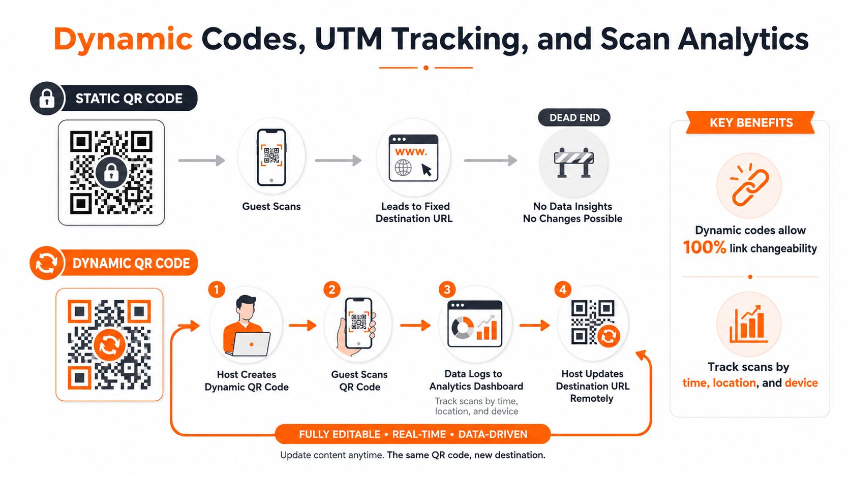
A static QR code points directly to the destination embedded during creation. If the URL changes, the printed poster must change too. A dynamic QR code routes the scan through a service that lets you update the destination without replacing the artwork, which is useful when house rules, Wi-Fi instructions, or local recommendations move.
Add UTM parameters to separate entry points. A door poster might use:
utm_source=door_poster&utm_medium=qr&utm_campaign=property_name
Use a different campaign or short identifier for the welcome book, Wi-Fi card, fridge sign, and bedroom poster. That gives you a clearer view of which physical placement earns attention and which one guests ignore.
Track the metrics that support an operational decision:
- Total scans: Shows whether guests use the printed entry point.
- Scans by time of day: Helps identify arrival-period usage and late-night demand.
- Scans by poster identifier: Separates the Wi-Fi card from the house manual or door sign.
- Destination behavior: Indicates whether guests reach the information they need after scanning.
Don't choose a tracking provider based only on a free-plan label. Check scan limits, destination editing, analytics access, redirect behavior, and whether the service adds an intermediate warning page. Shorteners that trigger redirect warnings on iOS can make a legitimate rental poster feel suspicious.
For a small portfolio, one unique code per property and placement is usually easier to maintain than one code shared everywhere. Change the headline or CTA in the artwork, retain the same destination structure, and compare the resulting scan activity over time without confusing one listing with another.
Placement, Accessibility, and On-Site Scan Testing
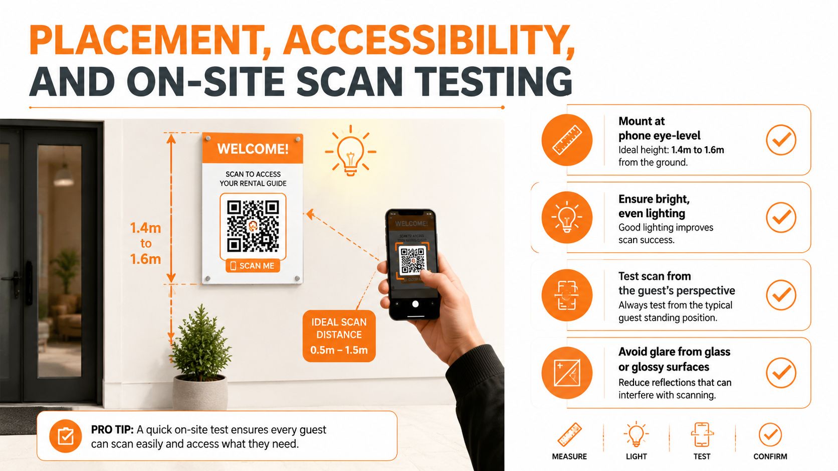
A good poster can still fail when the mounting location creates glare, shadow, or an awkward phone angle. Mount the code around guest phone height, with the phone center typically falling near 1.4–1.6 m from the floor. Keep it clear of the door swing, keypad glare, deep shadows, and visual clutter that makes the guest stand too close or too far away.
Use a matte laminate or anti-glare sleeve in bright entrances. Avoid mounting the poster directly against reflective glass unless you add a clean white border and test it at the actual approach angle. Textured walls can warp the paper, while backlighting can reduce the apparent contrast even when the original file looked correct.
Accessibility belongs in the first layout, not as a final adjustment. Use a legible sans-serif typeface at 24 pt or larger, maintain at least 4:1 contrast, and explain the destination in text so guests aren't forced to rely on color or the QR symbol alone. Add descriptive alt text when the poster appears in a digital welcome message or property webpage.
The real-property test
Run the test from the guest's perspective:
- Place the printed proof where the final poster will sit.
- Test from the expected standing distance and from a slightly wider approach.
- Try multiple angles, including a phone held one-handed beside luggage.
- Test under daytime, evening, and artificial lighting.
- Use three different phone models, such as a budget, mid-range, and flagship device.
- Complete at least six scans per poster, varying distance, angle, and lighting.
If scans fail, change one variable at a time. Remove the glossy sleeve, move the poster away from glass, increase the code size, restore a plain background, or improve the light. Don't redesign the entire poster before identifying the physical cause.
A short scan test video can help train cleaners, co-hosts, and property managers to check signs during turnovers.
For a more complete accessibility review, compare the poster against WCAG accessibility standards for readable contrast and content.
Pre-Print Checklist and Final Review
Treat the final review as a sign-off process, not a quick glance at the PDF thumbnail. The poster should work for a guest who knows nothing about your setup and has no reason to forgive a confusing or unreliable sign.
Destination and code
- Open the destination: Confirm the URL loads correctly on a phone and reaches the intended Wi-Fi details, house guide, check-in page, or service menu.
- Check the fallback: If the code uses a dynamic redirect, verify that the current destination can be changed without replacing the printed artwork.
- Confirm the purpose: Make sure the headline and call to action match what the guest will find after scanning.
- Review the settings: Confirm the quiet zone is intact and that the chosen error-correction level suits any logo treatment.
Print preparation
- Set the page size: Confirm the final A5 or larger dimensions before export.
- Protect the edges: Add the printer's required bleed, commonly 3 mm, while keeping essential text inside the safe area.
- Choose the right file: Prefer vector PDF, SVG, or EPS. Use PNG or TIFF at 300 DPI minimum when raster output is necessary.
- Check color handling: Confirm whether the printer needs CMYK or RGB and inspect the code against its actual background.
- Name versions clearly: Use one master PDF and one PNG backup with the property, placement, and revision in the filename.
Property review
- Measure the scan: Apply the 10:1 viewing-distance rule rather than guessing from the poster preview.
- Inspect the quiet zone: Keep at least four module widths clear on every side.
- Test the finish: Look for glare from glass, glossy laminate, plastic sleeves, or direct sunlight.
- Check the mount: Place the sign near phone height, away from shadows, door movement, and competing notices.
- Run physical scans: Test the final print with different phones, distances, angles, and lighting conditions.
The failures worth catching are predictable: a code too small for the entrance, branded colors that fall below the contrast threshold, glossy material in a bright foyer, and a code placed against glass without a white border. A poster can be visually polished and still fail its only important task.
Keep this compact sign-off beside your printer or property operations folder. Every new listing, seasonal update, and replacement poster should pass the same review before a guest sees it.
ScanStay provides a printable A5 QR poster that can connect guests to Wi-Fi, check-in and check-out details, house rules, local recommendations, and video help without requiring an app. If you want to replace repeated arrival messages with a tested guest-facing entry point, visit ScanStay and prepare your next rental poster from one central dashboard.