Airbnb Welcome Booklet Template: Impress Guests 2026
Craft a superb Airbnb welcome booklet template with our 2026 guide. Get essential sections, design tips & QR code use to impress guests and save time.
If you're still answering the same guest messages over and over, your welcome book isn't doing its job.
The pattern is familiar. A guest arrives late and can't find the Wi-Fi password. Another can't figure out the induction hob. Someone else asks whether they should leave towels on the floor at checkout, even though you already sent that in a message thread they never reopened. Most hosts treat the Airbnb welcome booklet template as a design task. It isn't. It's an operations system.
A good template does three things at once. It reduces repetitive questions, makes the stay feel smoother, and gives guests confidence that your place is professionally run. A great one goes further. It turns check-in, house guidance, local recommendations, and add-on offers into one clean experience guests can use on their phone.
Table of Contents
- Beyond the Binder Why a Welcome Booklet Matters
- The Anatomy of a Perfect Welcome Booklet Template
- Design and Branding Your Template for Impact
- From Printable PDF to Interactive QR Code
- Advanced Strategies Monetization and Personalization
- Conclusion Your Blueprint for a Better Guest Experience
Beyond the Binder Why a Welcome Booklet Matters
The biggest mistake hosts make is thinking the welcome book is a courtesy. It's infrastructure.
When Airbnb operates at 8 million vacation rentals across 220+ countries and regions worldwide according to Airbnb, guests are comparing your communication standards with everything else they've experienced on the platform. Clear instructions are no longer a nice touch. They're part of the product.
A welcome booklet matters because guests rarely ask questions in a logical order. They ask them when friction appears. That means the best booklet isn't the prettiest one. It's the one that removes friction before the guest feels it.
What it fixes immediately
- Arrival confusion: Door access, parking, entry codes, and Wi-Fi need to be findable in seconds.
- Appliance uncertainty: Coffee machines, thermostats, TVs, and hot water systems create avoidable support messages when instructions are buried.
- Rule misunderstandings: Quiet hours, smoking, pets, and checkout expectations need to be clear before they become a problem.
- Local decision fatigue: Guests appreciate a short, edited list of nearby recommendations more than a long tourist brochure.
Practical rule: If a guest has to message you to find something basic, the information is either missing, badly placed, or too wordy.
There's also a branding side to this. A polished Airbnb welcome booklet template signals that your place is managed deliberately. Guests may not compliment the formatting directly, but they feel the difference when everything is easy to find. That calm, organized experience tends to shape the whole stay.
If guest communication still feels reactive, it's worth reviewing practical systems for improving guest satisfaction. The hosts who seem effortless usually aren't doing more manual work. They've documented the right things once and made them easy to access.
The Anatomy of a Perfect Welcome Booklet Template
The best Airbnb welcome booklet template isn't long. It's layered. Guests should be able to skim the essentials fast, then dig deeper only if they need to.
Independent guidance from Lodgify's welcome book guide gets this right. A strong welcome book should be built for fast scanning with a table of contents, short sections, headings, bullet points, and a mobile-friendly format. That's the difference between a booklet guests use and one they ignore.
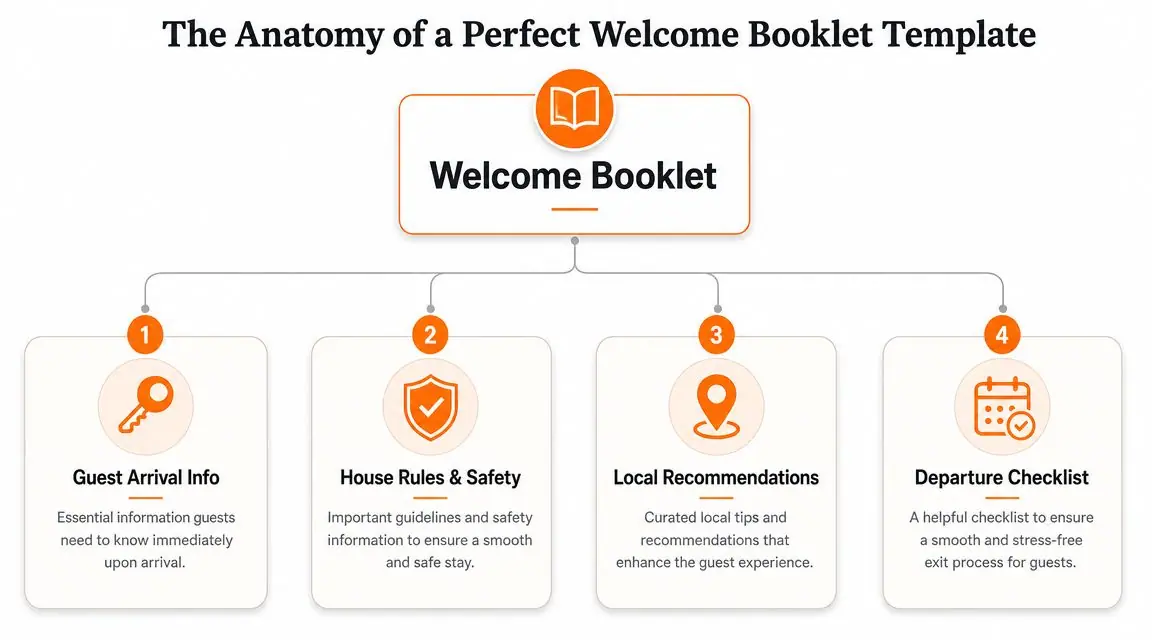
Start with what guests need in the first ten minutes
Most hosts open with a long welcome letter. That's backwards.
The first page should solve immediate arrival needs. Think survival information first, hospitality second. A guest walking in with luggage wants signal, access, comfort, and certainty.
Include these at the top:
- Wi-Fi details: Network name and password in large, obvious text.
- Entry basics: Door lock steps, gate access, alarm notes, or elevator details.
- Parking instructions: Assigned space, street rules, permit notes, or loading tips.
- Urgent contacts: Best contact method for property issues and emergencies.
- Checkout basics: Time and top-level expectations.
A short opening message still helps. Keep it brief. Something like: “Welcome. Everything you need for a smooth stay is in this guide. Start with Wi-Fi and house info below.”
Write house rules like a host, not a lawyer
House rules work best when they feel firm and reasonable.
Hosts often copy platform-style policy language into the booklet, and it reads like a warning notice. Guests tune that out. Write rules in plain English and frame them around care for the home, neighbors, and safety.
Compare these approaches:
| Weak wording | Better wording |
|---|---|
| No loud noise after 10 PM | Quiet hours start at 10 PM to respect neighbors in the building |
| Do not move furniture | Please leave furniture where it is so floors and walls don't get damaged |
| No smoking allowed anywhere | This is a non-smoking property. If anyone in your group smokes, please use the designated outdoor area only |
If you need help tightening this section, a dedicated Airbnb house rules template can make the tone more guest-friendly without making your standards softer.
Guests follow rules more reliably when they understand the reason behind them.
Add the sections that prevent avoidable messages
Once the arrival layer is solid, build the rest around moments of likely confusion. That usually includes:
- Appliance how-tos: TV input switching, heating or AC, coffee machine steps, dishwasher basics.
- Safety information: Fire extinguisher location, first aid kit, emergency exits, what to do if power trips.
- Local recommendations: A short list of places you'd recommend to a friend, not an overloaded directory.
- Troubleshooting: What to do if Wi-Fi drops, hot water runs cold, or the smart lock doesn't respond.
- Checkout checklist: Dishes, trash, used towels, windows, keys, and anything you want done before departure.
One thing many templates get wrong is depth. They either say too little or dump everything in full paragraphs. A better pattern is summary first, details second.
For example:
- Coffee machine
- Fill the rear tank with water
- Insert capsule
- Press the small cup button for espresso
- If the machine flashes, refill water and close the lid firmly
That structure feels almost too simple when you're writing it. That's usually a sign you're doing it right.
Design and Branding Your Template for Impact
Information gets used when the layout feels easy.
A lot of hosts over-design the welcome book. Fancy script fonts, decorative backgrounds, long paragraphs in tiny type. It may look stylish on Canva, but guests don't read it when they're standing in the kitchen trying to work the hob.
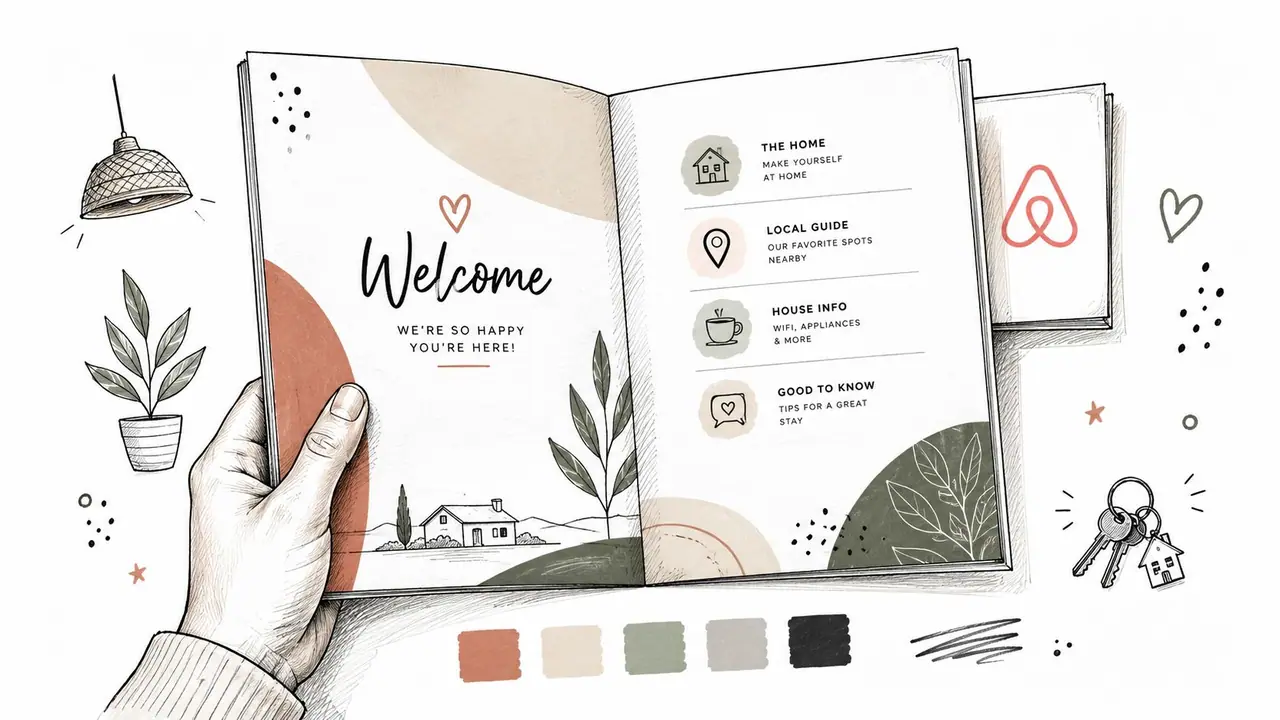
Make it look calm and usable
Good design for a vacation rental guide is mostly restraint.
Use one readable heading font and one body font. Keep enough white space around each section. If you're printing, don't rely on pale gray text or low-contrast color blocks. If you're sharing it digitally, make sure buttons, headings, and links are easy to tap on a phone.
A simple checklist helps:
- Prioritize readability: Sans serif body fonts usually work better than decorative fonts.
- Limit color choices: Pull two or three colors from the property interior and use them consistently.
- Use real photos carefully: Show parking, entry doors, remote controls, or appliance buttons when that image removes ambiguity.
- Keep page rhythm consistent: Similar heading sizes, spacing, and section order help guests orient quickly.
Match the booklet to the stay
Your booklet should feel like the property, but it shouldn't copy the property at the expense of clarity.
A city apartment can carry a cleaner, more minimal look. A cottage can be warmer and more textured. A family-focused stay can use more icons and clearer labels. Brand voice matters too. If your listing feels relaxed and local, the booklet shouldn't suddenly sound corporate.
A welcome book doesn't need to be luxurious. It needs to feel intentional.
The easiest branding win is consistency. Use the same property name, visual style, and tone across your listing, pre-arrival message, printed materials, and booklet. Guests notice when each touchpoint feels connected.
From Printable PDF to Interactive QR Code
A printed binder still has a place. So does a PDF attached to a pre-arrival message. But both formats start to struggle when you need updates, multiple properties, multilingual delivery, or cleaner guest access.
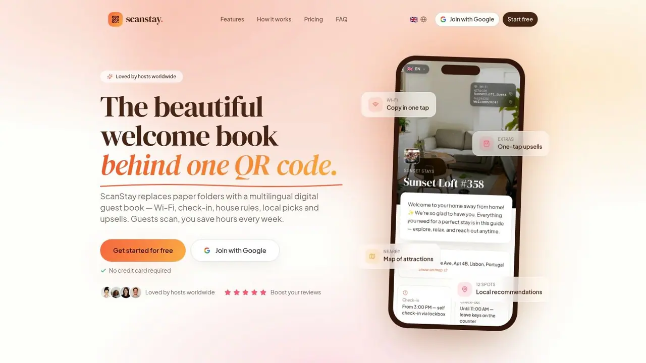
That's the gap many template guides don't address. As noted in an Etsy template listing focused on welcome book formats, most existing content still centers on static PDFs and print-first workflows, leaving hosts without a clear path to a mobile, QR-based guide guests can open instantly without installing an app.
Where printable booklets still work
Printed welcome books work well in a few specific scenarios.
Remote cabins with weak connectivity benefit from an offline version. Design-forward stays may want a physical booklet as part of the in-room experience. Some guests prefer flipping through a few pages on the coffee table.
PDFs also have one obvious strength. They're easy to create with tools like Canva, Google Docs, or Adobe Express. If you're starting from zero, a PDF is better than scattered messages and sticky notes.
Why static files break down in real operations
The problem isn't that PDFs are bad. It's that they freeze information.
The restaurant you recommended closes on Tuesdays. The lock code changes. The check-out instructions shift for same-day turnover. A new coffee machine arrives. Every one of those changes turns a static file into a maintenance problem.
Printed binders also create friction in practice:
- Guests don't always notice them: Especially in smaller apartments with self-check-in.
- Pages age badly: Spills, torn sleeves, and missing inserts make the property feel less cared for.
- Updating is annoying: One small change means re-exporting, reprinting, and replacing copies.
- They aren't interactive: You can't tap a map, watch a how-to, or open directions in one move.
For hosts building contactless systems, a QR code check-in system fits naturally with how guests already behave. They arrive with a phone in hand. The easiest information is the information they can scan and use immediately.
Printable PDF vs Digital QR Code Welcome Book
| Feature | Printable PDF | Digital QR Code Book (e.g., ScanStay) |
|---|---|---|
| Access method | Email attachment, printed copy, or downloaded file | Instant phone access by scanning a code |
| Updates | Manual edits, resend, or reprint required | Edit once and guests see the latest version |
| Mobile usability | Often awkward if designed for print | Built for phone screens |
| Guest friction | Can get buried in inboxes or ignored on site | Quick access at arrival and during stay |
| Multimedia | Limited to static text and images | Can include maps, videos, and interactive links |
| Multi-property management | Harder to standardize across units | Easier to reuse structure and tailor details |
| Upsells and add-ons | Clunky and easy to miss | Can be placed contextually inside the guide |
| Physical wear | Printed versions need replacement | No binder wear or missing pages |
What a better delivery method looks like
The strongest setup for many hosts is a hybrid.
Send a digital version before check-in. Place a QR code in the unit for instant access on arrival. If you want a physical touch, leave a one-page printed summary with the Wi-Fi, checkout basics, and scan code rather than a bulky binder.
That approach keeps the tactile reassurance of a printed item while moving the actual operating manual into a format you can update any time.
A short walkthrough helps make the shift concrete:
When hosts move from “document” thinking to “access” thinking, the booklet gets better fast. Guests don't care whether you built it in Canva, Docs, or a hospitality tool. They care whether the answer is available the moment they need it.
Advanced Strategies Monetization and Personalization
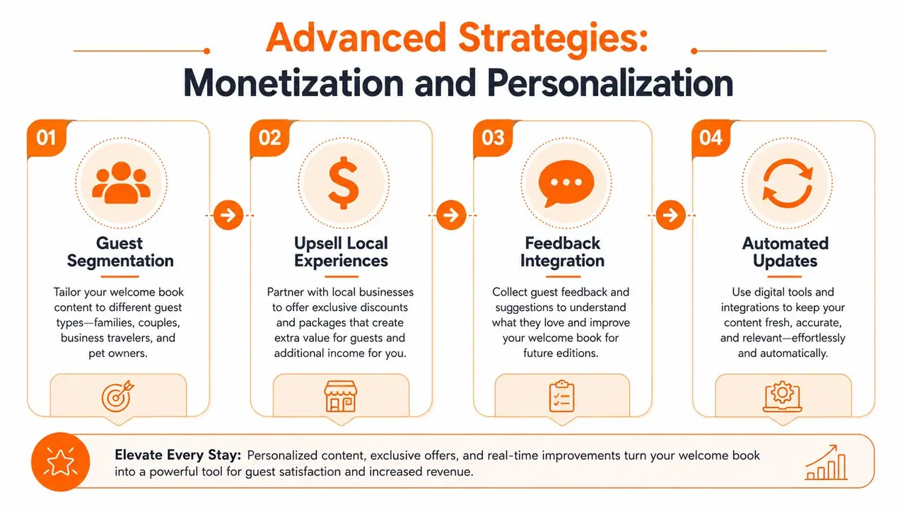
Once the guide is digital, it stops being just an information sheet. It becomes a guest-facing operating layer you can refine over time.
That opens up two useful advantages. First, you can present paid extras in a way that feels relevant instead of pushy. Second, you can adapt the experience for different guest types without rewriting everything for each booking.
Turn the guide into a revenue surface
Most hosts underuse the welcome book after check-in. That's a missed opportunity.
Guests are far more likely to consider extras when the offer appears at the right moment inside the stay experience. A late checkout option belongs near checkout info. Airport transfer details belong in arrival guidance. Equipment rental belongs next to amenity information or local activity tips.
Useful examples include:
- Late checkout requests: Offer a simple upgrade path instead of making guests message to ask.
- Mid-stay cleaning: Especially relevant for longer bookings and family stays.
- Transport help: Airport pickup, local driver contacts, or luggage storage options.
- Partner offers: Curated local businesses that fit your guest profile.
The key is restraint. One or two relevant offers outperform a cluttered page full of promos.
Put paid extras where they solve a real guest need. Don't bolt them on like banner ads.
Personalize without creating admin chaos
Personalization doesn't mean writing custom guides for every booking. It means designing flexible content blocks.
A family-friendly property might show local parks, grocery stores, and stroller-friendly cafes higher up. A couple's retreat might lead with restaurants, scenic walks, and spa recommendations. If you host international travelers often, translated content matters because guests shouldn't need to decode safety or appliance instructions after a long trip.
A strong digital setup can also help you learn what guests use. If people keep opening the appliance section and ignoring your long local guide, that tells you where confusion lives. You can then tighten the content, add a better photo, or swap in a short video.
Keep one final layer in place as well:
- Legal basics: Any required disclaimers, property-specific notices, or compliance language should be easy to find.
- Version control: Make one person responsible for updates so details don't drift.
- Seasonal edits: Swap recommendations and operational notes as weather, events, or amenities change.
An Airbnb welcome booklet template becomes more than a reusable file. It becomes a repeatable guest system.
Conclusion Your Blueprint for a Better Guest Experience
The best Airbnb welcome booklet template doesn't win because it looks polished. It wins because guests can use it under real conditions. Late arrival, low patience, luggage in hand, phone in the other.
That's why the binder-first mindset is starting to show its limits. A printed guide can still support the experience, but the core value comes from organizing your information so it stays clear, current, and easy to access. Done well, the welcome book reduces repetitive messages, sets better expectations, and gives guests a smoother stay from arrival to checkout.
If you're starting from scratch, build the core structure first. Arrival info, house rules, appliance guidance, local recommendations, troubleshooting, checkout. Then tighten the language until each section feels scannable. After that, decide how you want guests to access it. Print, PDF, QR code, or a hybrid setup.
The shift that matters isn't analog versus digital. It's reactive hosting versus proactive hosting. Once your guide answers the right questions at the right moment, your property starts to feel easier to run.
If you're ready to replace paper binders and scattered guest messages with a cleaner digital system, ScanStay gives hosts one QR code for Wi-Fi, check-in info, house rules, local recommendations, video how-tos, and service upsells, all in a mobile browser with no app required.