A5 Poster Printing Guide for Short-Term Rentals
Master A5 poster printing for short-term rentals with practical steps covering dimensions, bleed, QR setup, paper choices, proofing, and display.
You're standing in the hallway after a late check-in, suitcase beside you, phone at 8% battery, and the guest is searching for the Wi-Fi details that were buried in a message thread. The A5 poster by the door should make that moment easy. If the QR code is too small, the text is crowded, or glare washes out the print, the guest won't keep trying. They'll message you instead.
Good A5 poster printing connects the physical property to the digital welcome book. It gives guests a clear visual cue, points them toward essential information, and helps your brand feel considered rather than improvised. The format works especially well when wall space is limited, but only when the file, paper, placement, and mobile destination have been designed as one experience.
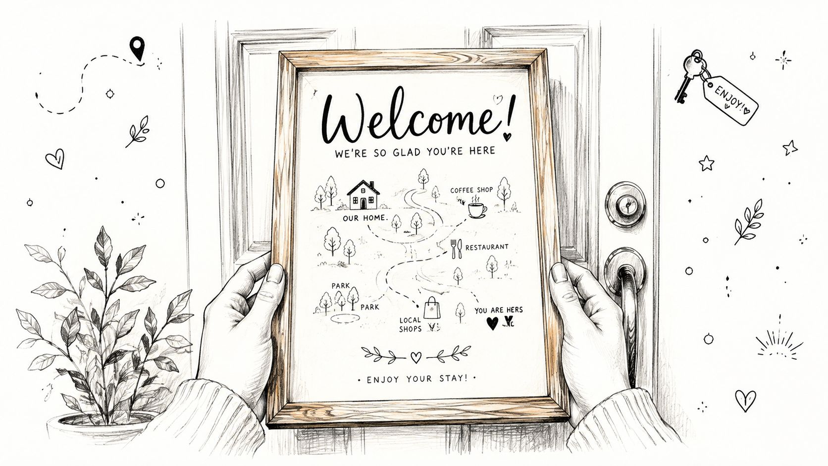
A poster can direct someone to check-in instructions, Wi-Fi credentials, house rules, local recommendations, and emergency contacts without forcing them to search through a booking platform. A well-planned vacation rental welcome book gives the QR code somewhere useful to lead, while the printed sign remains the obvious hand-off point at the property.
Table of Contents
- Why the A5 Poster Matters More Than You Think
- A5 Dimensions, Bleed, and the Working File
- Resolution, Color, and File Format Choices
- Choosing Between A5, A4, and A6 for Your Entryway
- QR Code Sizing, Contrast, and Placement
- Paper Types, Weights, and Finishes That Hold Up
- Proofing, Printing Routes, and Mounting the Poster
Why the A5 Poster Matters More Than You Think
The guest doesn't encounter your poster in a design studio. They see it while carrying bags, looking for a light switch, checking the lockbox, or trying to work out whether the nearest door leads to the kitchen or the bedroom. At that point, clarity beats decoration.
An A5 sign often performs three jobs at once:
- Branding: It reassures guests they're in the right place and reinforces the property's visual identity.
- Wayfinding: It tells them what to do next, such as “Scan for your guest guide.”
- QR hand-off: It moves them from a physical sign to a mobile welcome page without making them type a long address.
The most useful poster I've seen in a rental wasn't the most elaborate. It had a short headline, a large QR code, one sentence explaining what guests would find after scanning, and a visible fallback instruction. A guest could understand it before putting down their luggage. That matters more than adding a long list of amenities that nobody reads at the door.
Practical rule: If a tired guest can't understand the poster in a quick glance, remove content before adding visual effects.
A5 is standardized under the ISO 216 system at 148 × 210 mm, with a printing area of about 0.031 m², as documented by Adobe's A5 format guide. That standardization makes the format easy to order, replace, and scale within metric print workflows. It also gives hosts a practical middle ground. The sign is more visible than a small card but less intrusive than a full sheet of paper.
The format won't solve a weak guest journey by itself. A QR code leading to a slow, cluttered page still creates friction, and a beautiful poster with no alternative for guests who can't scan it leaves people stranded. The strongest result comes from treating the sign as a small interface, not as a decorative notice.
A5 Dimensions, Bleed, and the Working File
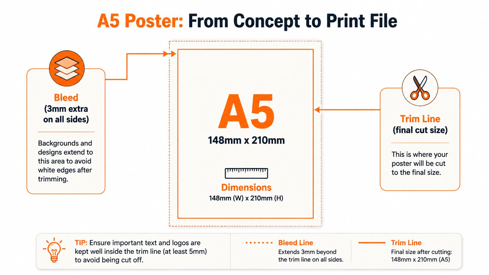
Start with the finished size, then build the file around the printer's cutting process. The trim size of A5 is 148 × 210 mm, or approximately 5.8 × 8.3 inches. Your background artwork must extend beyond that final edge because commercial cutting can leave a narrow unprinted strip when the design stops exactly at the trim line.
Add 3 mm of bleed on every side. That changes the working file to 154 × 216 mm, and at 300 dpi it corresponds to roughly 1819 × 2551 pixels with bleed, according to this A5 document size and bleed guide.
Set up the file correctly
In Canva, choose a custom size and enter the working dimensions if the export workflow doesn't add bleed automatically. In Adobe Express, Affinity Publisher, or InDesign, create the document at the trim size and set the document bleed to 3 mm. Printer interfaces vary, so check whether the export should include crop marks and whether the supplied template already includes bleed.
Keep key elements away from the cut. A 5 mm safe zone inside the trim line is a sensible boundary for headlines, contact details, logos, and the QR code. Background colors, full-bleed photographs, and decorative shapes can run into the bleed. Text and scannable elements shouldn't.
The common mistake is placing a border close to the edge. Even when the file includes bleed, a thin border can look uneven after trimming because tiny cutting variations become obvious. Use a generous background instead, or keep the border comfortably inside the safe zone.
Before exporting, inspect the file at actual size on screen and print a rough version at home. Check that the QR code isn't sitting near the trim line, that the headline has breathing room, and that no essential information depends on a narrow margin surviving perfectly.
Resolution, Color, and File Format Choices
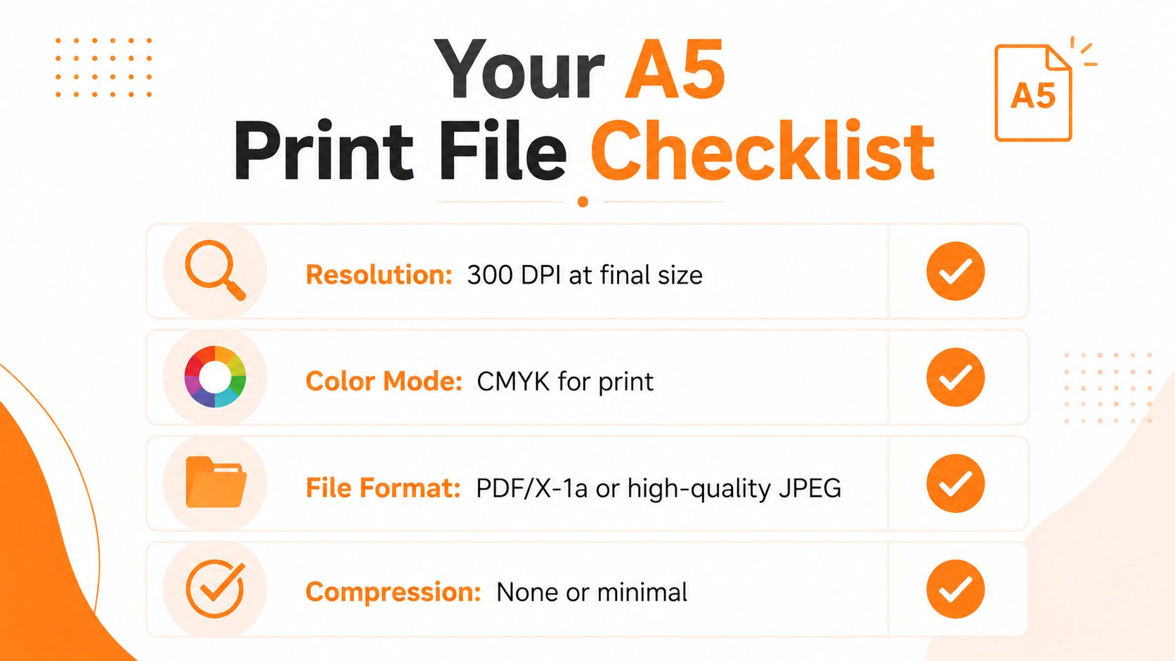
For an A5 poster viewed at close range, use 300 dpi at final size as the working benchmark. That equals about 1748 × 2480 pixels without bleed, while the bleed-inclusive file uses the larger dimensions described above, according to Pixartprinting's A5 paper guidance.
A lower resolution may look acceptable in a photograph or on a phone screen but turn soft when printed. Large-format workflows can tolerate 150 to 200 dpi when viewers stand farther away, but an A5 guest sign is usually read at eye level. Small type, thin icons, and QR edges need more care than a distant event banner.
Protect the details
Use vector artwork for logos, icons, and the QR code whenever possible. Vector elements remain sharp as the printer processes them, whereas a small raster logo can become visibly fuzzy around lettering and curves. If your artwork includes generated imagery, the practical advice in this resource on printing AI art at home is useful for understanding how source resolution affects the final print.
Color needs a separate reality check. Your monitor displays light in RGB, while many commercial presses reproduce color through CMYK inks. A vivid blue or orange that looks excellent on screen can print more muted, darker, or less saturated. Ask the printer whether they expect a CMYK PDF, and use their color profile if they provide one.
Choose the export that matches the route
A press-ready PDF is usually the safest choice for a commercial print shop because it preserves page dimensions, fonts, vector elements, and bleed in a single file. If the printer requests PDF/X-1a, export to that standard rather than guessing at settings.
A high-resolution PNG can work for a home printer or a simple online upload, but it gives you less control over print production details. TIFF is useful for high-quality raster artwork, though it's rarely the most convenient format for a one-page hospitality sign. Avoid repeatedly saving and resaving compressed files, especially JPEGs, because compression can soften small type and QR edges.
Choosing Between A5, A4, and A6 for Your Entryway
A5 isn't automatically the right answer. Stand where the guest will stand, look at the available wall, and ask whether the sign must be read from across the room or only after someone approaches it. The right format depends on viewing distance, wall space, and scan friction, not on habit.
| Format | Dimensions (mm) | Best Viewing Distance | Best-Fit Scenario |
|---|---|---|---|
| A4 | 210 × 297 | Farther across an entryway | Family rental, broad hallway, or information-heavy arrival point |
| A5 | 148 × 210 | Close to eye level | Most apartments, compact houses, and door-side QR hand-offs |
| A6 | 105 × 148 | Very close range | Small studios, bedside reminders, or secondary signs |
A4 earns its space when the guest needs to read more from a standing position or when the wall is visible before they reach the door. It gives a headline and supporting instructions more room, but it can feel oversized beside a narrow lockbox or crowded coat area. A larger poster also tempts hosts to add more text, which can cancel out the readability advantage.
A6 works for a single action, such as “Scan for Wi-Fi,” when the guest is already close. It's less forgiving for a QR-led welcome guide because every element competes for limited space. It's better as a secondary reminder than as the only physical welcome point.
A5 usually wins in a tight entryway because it's noticeable without dominating the wall. It leaves enough room for a clear message and a comfortably placed QR code, provided you don't turn it into a miniature handbook.
Placement test: Tape a blank sheet at the intended height, walk through the entry with your hands full, and decide whether you notice it before reaching for your phone.
Frame choice affects the practical result too. Measure the visible opening, not just the advertised frame size, and use this guide to choose a frame for your original poster when comparing display options.
QR Code Sizing, Contrast, and Placement
A QR code that doesn't scan has failed at its only technical job. Guests won't diagnose whether the problem is glare, distance, poor contrast, a damaged print, or a weak phone camera. They'll try once, then look for your number.
Use a large, high-contrast code with a clear light area around it. The quiet zone, the blank margin separating the code from nearby text and graphics, must remain intact. Don't place the code over a photograph, textured background, colored pattern, or dark panel. A black code on a clean white or very light background is less attractive than a stylized version, but it's far more dependable in a dim hallway.
Keep the code comfortably inside the 5 mm safe area and leave room around it for a guest to aim a phone camera. A cramped code beside a headline or frame edge creates unnecessary scan friction. The printer guidance on A5 flyer production also emphasizes bleed, safe areas, vector logos, press-quality PDF export, and testing the finished piece.
Design the destination, not just the sign
The QR destination should open in a mobile browser without an app download. It needs to load cleanly on a phone, use readable text, and surface the most urgent details first. Wi-Fi instructions, check-in information, house rules, and emergency contacts shouldn't be hidden beneath a large hero image or a maze of menus.
The page also needs a fallback for people who can't scan. Print a short, readable web address beneath the QR code, and make sure the digital version contains the same essential information as the poster. Accessibility guidance recommends combining printed communication with digital copies, large-print alternatives, and document checks rather than treating one poster as a complete solution.
The same principle applies outside rentals. Resources about Wedding QR codes are useful because they show how a printed code can connect a physical sign to a mobile information experience, provided the destination remains easy to reach and use.
For rental-specific implementation details, follow these QR code best practices and test the final printed code on more than one phone. Scan it under the actual lighting conditions near the entrance, including evening light, overhead glare, and any acrylic or glass cover you plan to use.
Paper Types, Weights, and Finishes That Hold Up
Paper changes how the poster feels in the hand, how it reflects light, and how long it survives near a door. The cheapest stock can curl, show fingerprints, or look temporary after repeated cleaning. A premium finish can look polished but introduce glare that makes a QR code harder to scan.
Uncoated stock gives a soft, natural appearance and usually keeps reflections under control. It's comfortable to read under mixed lighting, but porous paper can absorb marks and moisture. Silk stock offers a balanced surface with a more refined appearance, while gloss produces stronger color and shine. Gloss can be a poor choice beside a bright lamp or behind glass because the reflection may land directly over the code.
Lamination adds protection, but the finish matters. Matte lamination reduces reflections and gives a more tactile surface, while gloss lamination is more vulnerable to hot spots from lighting. In a kitchen, entrance lobby, or property with frequent handling, a protected surface can justify the added cost. In a quiet cottage where the poster sits behind a frame, it may be unnecessary.
Match the stock to the property
- High-traffic rental: Choose a sturdy card or protected silk surface, with matte protection if the poster sits near a light source or is likely to be handled.
- Compact apartment: Use a clean, moderately substantial stock that sits neatly in a slim frame and doesn't crowd the entryway.
- Low-use cottage: A quality uncoated or silk sheet can be enough when the sign stays dry and guests interact with it briefly.
- Kitchen or poolside location: Favor wipeable protection, but test the laminated sample for reflections before ordering the batch.
Avoid making the paper so glossy that guests need to tilt their phone to scan. Print a sample, hold it at the mounting location, and check the code from the position where a guest will use it.
Proofing, Printing Routes, and Mounting the Poster
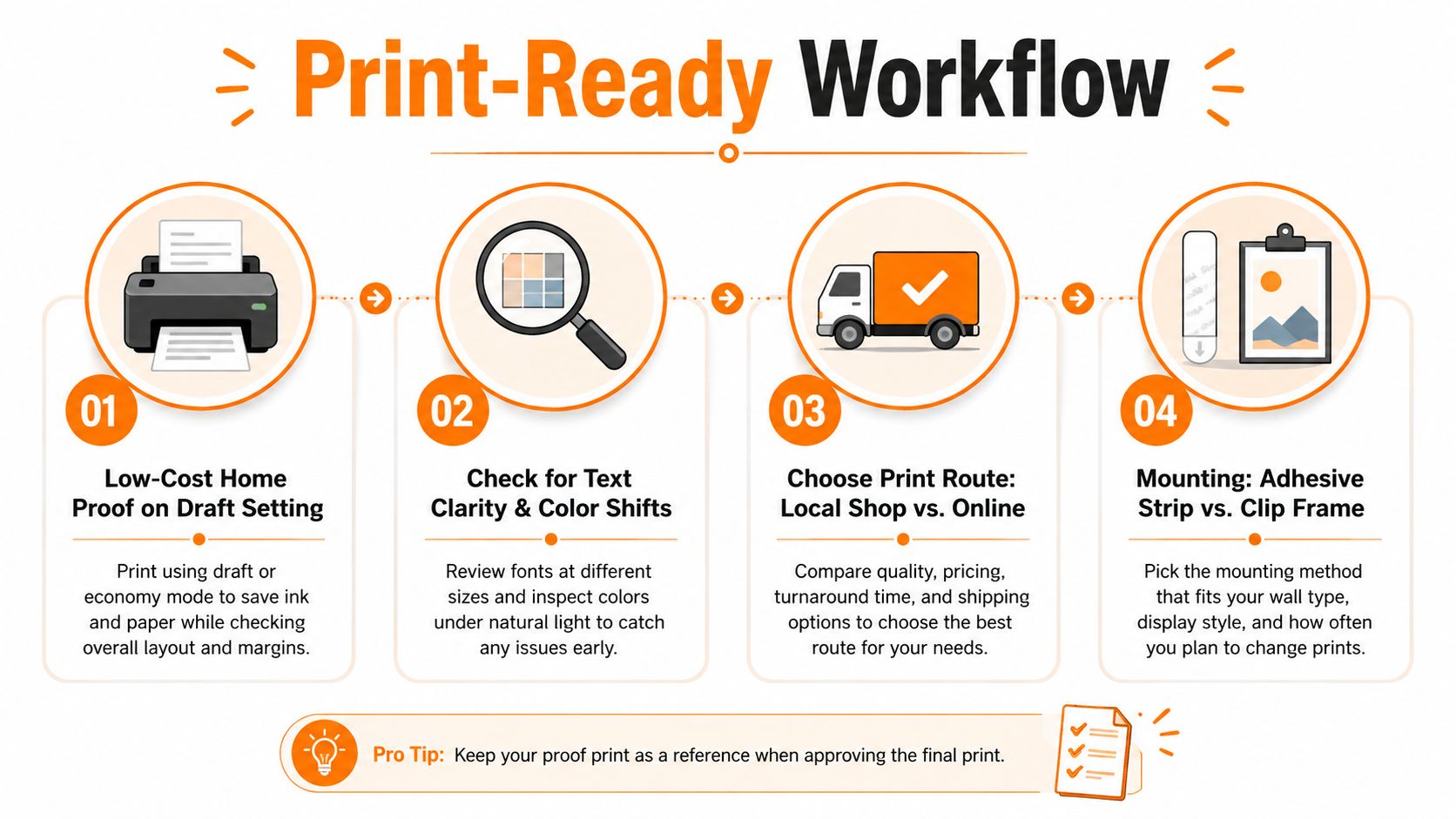
A file can look perfect on your monitor and still disappoint when it arrives. The most revealing test is a physical proof viewed in the property, under the same light and from the same position where guests will scan it.
A home proof doesn't need to match the final printer's color exactly. Its purpose is to expose layout problems, unreadable text, weak hierarchy, and a QR code that feels too small. Print the design at its intended physical size if your printer allows it, then tape it to the wall rather than judging it flat on a desk.
What to check on the proof
Look at the poster as a guest would, not as its designer.
- Read the headline: Can you understand the action without studying the page?
- Check the QR: Does the phone camera recognize it quickly under the property's real lighting?
- Inspect the margins: Are text, logos, and code safely inside the trim area?
- Review the destination: Does the page open in a browser and show the useful information immediately?
- Test the fallback: Can a guest type the short address if scanning isn't possible?
- Assess the finish: Does the paper curl, glare, or look fragile beside the rest of the room?
Accessibility should also be part of proof approval. Guidance from the American Anthropological Association's poster accessibility recommendations supports screen-reader-friendly alternatives, digital copies, large-print versions, and document accessibility checks. For a rental, that means the QR destination should duplicate essential instructions in a lightweight, readable format, while the physical poster should use strong contrast and avoid making the QR code the only route to help.
Pick the printing route
A local print shop makes sense for a one-off poster, a fast replacement, or a job where you want someone to check the file with you. You can show them the proof, ask about paper samples, and resolve an unexpected color or trim issue in person. The trade-off is that one-off local pricing and turnaround may not suit a larger portfolio.
An online printer is convenient when you need repeat copies or several property versions. Uploading a press-ready PDF keeps the process consistent, but you'll need to understand the supplier's bleed requirements, paper choices, and proof policy before approving the order. Save each property's final file with a clear name so you don't accidentally print the wrong Wi-Fi details at the wrong address.
Home printing is useful for an emergency replacement or a property where you control a capable photo printer. It gives you immediate control over revisions, but borderless output, color consistency, paper handling, and ink durability vary by machine. A home print can rescue a late arrival, yet it may not have the professional finish or moisture resistance of a commercial job.
ScanStay is one option for hosts who want a printable A5 QR poster connected to a browser-based digital welcome book. Its platform can place Wi-Fi details, check-in information, house rules, recommendations, and other guest guidance behind a single QR code, so the printed sign doesn't need to carry the full content itself.
Mount for visibility and easy replacement
A frame protects the sheet and gives the sign a deliberate place in the room. Choose a non-glare front where possible, because acrylic and glass can create reflections that interfere with scanning. A clip frame makes replacements quick, while a standard frame gives a more finished appearance.
Adhesive strips work well when you can't drill, but check the wall surface and the strip's load rating before installation. Place the poster near the natural arrival path, such as beside the entry, lockbox, or main light switch, rather than hiding it behind a door or among unrelated notices.
If you use a fridge placement, keep the sign away from magnets, reflections, and visual clutter. A guest should see the headline and QR code without moving objects first. For emergency instructions, use a dedicated visible route and keep the digital copy aligned with the information on your emergency contact information page.
Use this final pre-flight check
- Document setup: Confirm the A5 trim size and the printer's required bleed.
- Bleed and safety: Extend backgrounds into the bleed and keep critical elements inside the safe zone.
- Resolution: Confirm raster images are suitable for final-size printing and keep logos and QR artwork vector where possible.
- Export: Use the press-ready PDF specification requested by the printer.
- Physical proof: Print, mount temporarily, and inspect the sign in its real location.
- Scan test: Test the code under daytime and evening lighting, with the final frame or cover in place.
- Fallback access: Include a short web address or another clear route for guests who can't scan.
- Accessibility: Check contrast, readable text, digital alternatives, large-print needs, and document accessibility.
- Mounting: Secure the poster without blocking switches, locks, or other essential fixtures.
- Replacement plan: Keep the editable master file and a clearly named print-ready PDF for quick reorders.
A5 works because it stays compact while still giving the guest a visible bridge into the digital guide. The result depends less on filling the page than on removing obstacles between the guest, the QR code, and the information they need.
ScanStay provides a printable A5 QR poster that links guests to a mobile welcome book with Wi-Fi, check-in details, house rules, local recommendations, and more, without requiring an app. Visit ScanStay to create the QR-led hand-off, print it, test it in your entryway, and give late-arriving guests a clearer first step.