Property Management Dashboard: A Complete Guide for Hosts
Master your rentals with a property management dashboard. Learn to track KPIs, automate tasks, and boost revenue on Airbnb & Booking.com.
If you're managing even a small portfolio, you already know the pattern. One tab has Airbnb reservations. Another has Booking.com. Your PMS has the cleaner schedule, your bank feed has the true story on cash flow, and guest messages are coming in faster than you can sort them. By noon, you've answered three avoidable questions, missed one maintenance follow-up, and still haven't looked at next week's occupancy.
That kind of work feels busy, but it isn't controlled. A good property management dashboard changes that. It doesn't just make reports prettier. It changes how you run the day, how your team reviews the week, and how you catch revenue leaks before they become owner conversations.
Table of Contents
- From Chaos to Control with a Central Dashboard
- What Is a Property Management Dashboard
- Must-Have Dashboard Features for Short-Term Rental Hosts
- The Only 7 KPIs Short-Term Rental Managers Need to Track
- Setting Up Your Dashboard An Implementation Checklist
- Sample Workflows That Save Time and Boost Revenue
- Common Pitfalls and How to Avoid Them
From Chaos to Control with a Central Dashboard
Most hosts don't start with a dashboard. They start with whatever works this week. A spreadsheet for revenue. A calendar screenshot for cleaners. Notes in Slack or WhatsApp. Saved replies in one platform, manual follow-ups in another. That patchwork can hold together for one property. It breaks fast once you add more units, more channels, more staff, or more owner reporting.
The problem isn't just fragmentation. It's timing. Property operations move on a daily, weekly, and monthly cadence. A guest issue needs a same-day response. A pricing shift needs a weekly review. A margin problem often shows up only when the month closes. If your data lives in five places, you react late at every level.
Why centralization matters now
The broader market is moving in the same direction. The global property management market was valued at USD 26.49 billion in 2024 and is projected to reach USD 50.87 billion by 2032, expanding at a CAGR of 8.50%, driven by software adoption and the need for dashboards that centralize operations, according to Data Bridge Market Research on the global property management market.
That growth matters because it reflects a shift in expectations. Owners expect faster answers. Teams expect cleaner workflows. Operators who still rely on disconnected spreadsheets aren't just inconvenienced. They're slower.
Practical rule: If your morning starts by asking, "Which system has the right number?" you don't have a reporting problem. You have an operating problem.
What changes when you use one command center
A real property management dashboard gives you one place to review the health of the business. Not every detail. Just the details that matter enough to act on.
That means you can see:
- What needs attention today. Arrivals, departures, unresolved maintenance, cleaning gaps, guest issues.
- What needs judgment this week. Occupancy trends, pricing decisions, underperforming listings, staffing pressure.
- What needs explanation this month. Revenue, NOI, portfolio comparisons, repeat service failures, owner reporting.
The best dashboards don't eliminate work. They eliminate hunting. That's the difference between feeling overloaded and being in control.
What Is a Property Management Dashboard
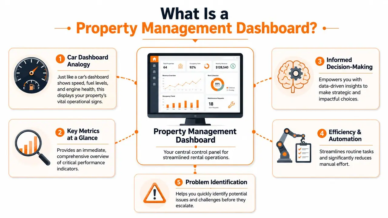
A property management dashboard is your operating screen for the business. It collects data from the systems you already use and turns it into one view you can trust. When it's configured well, you don't open it just to admire charts. You open it to decide what to do next.
Think of it like a car dashboard
The car analogy works because drivers don't need the engine exposed to know whether something needs attention. They glance at speed, fuel, warnings, and temperature. Then they act.
A property management dashboard works the same way. You glance at occupancy, revenue, unresolved tasks, guest sentiment, and maintenance alerts. If something is off, you drill down.
That last part matters. A dashboard isn't just a static report. It should let you move from top-line view to the underlying unit, reservation, message thread, or work order. Without that drill-down, you're still doing detective work.
A dashboard is useful when it shortens the distance between noticing a problem and assigning the fix.
What the dashboard pulls together
In practice, the dashboard sits above your core tools. For short-term rental operators, that usually means your PMS, channel managers, booking platforms, accounting tools, maintenance workflows, and guest communication systems.
A strong setup usually brings together these streams:
| System area | What it contributes |
|---|---|
| Channels | Reservations, calendar status, cancellations, pacing |
| PMS | Unit data, task schedules, stay details, operational status |
| Finance tools | Revenue, fees, expenses, owner distributions, NOI |
| Maintenance systems | Open tickets, response time, repeat issues |
| Guest comms tools | Message volume, common questions, service gaps |
The value isn't that all data exists in one place. The value is that your review process changes. Instead of checking each app separately, you use one front door for the business.
A lot of teams miss this and build a "nice-to-have" dashboard that nobody opens. The dashboard has to fit the role. An operations manager needs open issues, turnovers, and maintenance bottlenecks. A finance lead needs NOI, cash flow patterns, and portfolio comparisons. A generic all-purpose screen usually pleases no one.
Must-Have Dashboard Features for Short-Term Rental Hosts
A property management dashboard lives or dies on workflow, not on visual polish. Hosts often get distracted by fancy charts and forget the simple test. Does this screen reduce clicks, cut handoffs, and help someone act faster?
The right features do that. According to Bold BI's property management dashboard overview, enterprise-grade dashboards with live data ingestion, customizable reports, and automated alerts reduce manual reporting time by 40%. The same source says organizations using them see 30% faster maintenance resolution and 15% higher net operating income.
Booking and channel control
The first essential is a clean operating view of reservations across channels. If you're still reconciling calendars manually, you're spending attention where software should already be helping.
Look for:
- Unified calendar visibility. You need to see arrivals, departures, blocked dates, and turnover pressure across Airbnb, Booking.com, and direct channels in one place.
- Live data ingestion. Delayed syncs create false confidence. A dashboard only works when the booking, cancellation, and availability picture is current.
- Custom alerts. If occupancy drops below your own threshold or a same-day turnover has no assigned clean, the system should flag it without waiting for you to discover it.
For smaller operators comparing options, this guide to affordable property management software for growing rental operations is a practical place to start.
Financial visibility
Revenue problems usually aren't dramatic. They're quiet. A missed fee here, a stale rate there, an underperforming unit hidden inside a strong portfolio average. That's why the financial side of the dashboard should be direct, not decorative.
Useful financial features include:
- Rental income by property and unit
- Expense tracking tied to the same reporting view
- NOI visibility without exporting to another sheet
- Report templates for owners, managers, and internal reviews
If the system can't separate an owner report from an internal operating report, it creates extra work. Teams end up exporting data, cleaning it, then rebuilding what the dashboard should have shown in the first place.
Operations and guest communication
Hosts feel their biggest daily relief thanks to a property management dashboard. This tool should reduce the constant swivel between tasks, people, and platforms.
What works well:
- Maintenance ticket tracking with alerts
- Cleaning and turnover status
- Task assignment by property or stay
- A unified inbox or communication layer
- Exception-based views, where only overdue or off-track items are highlighted
What doesn't work is a dashboard that requires manual updates to stay useful. If your cleaners, maintenance vendors, and guest messaging tools don't feed the system, the screen becomes a presentation layer instead of an operating layer.
The best dashboard feature is often the one that removes a recurring status meeting.
The Only 7 KPIs Short-Term Rental Managers Need to Track
Most dashboards fail because they try to prove how much data they can hold. That creates clutter, not control. In day-to-day portfolio management, a short list of KPIs usually tells you almost everything you need to know.
A functional dashboard must track core metrics such as occupancy rate, rental income, maintenance resolution time, tenant satisfaction, and net operating income per door to support action, according to UseDatabrain's guide to property management dashboard KPIs. The same source notes that unresolved maintenance requests beyond 48 hours can cause a 15–20% drop in tenant satisfaction scores.
The seven that matter most
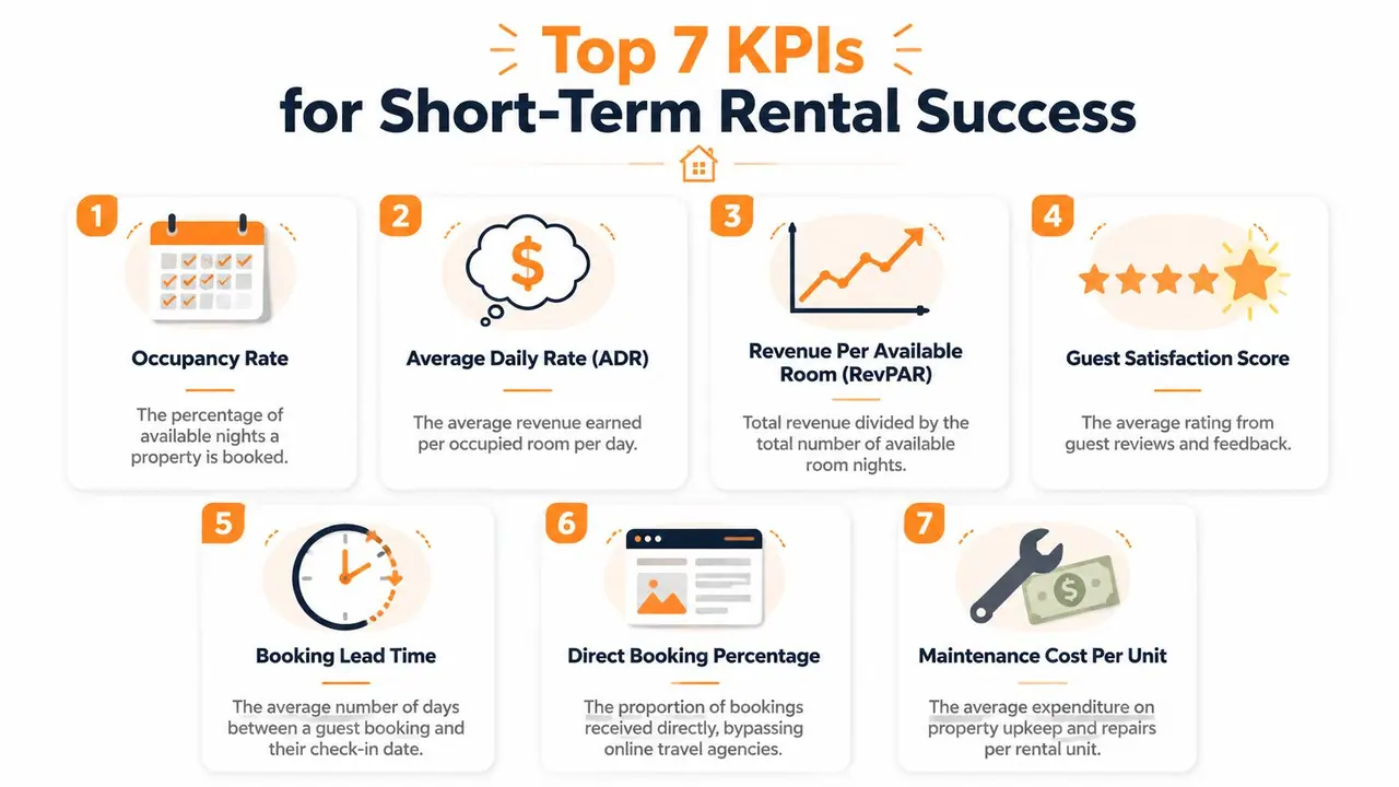
For short-term rentals, these are the seven I'd keep front and center:
Occupancy rate
This tells you how well your calendar is being filled. On its own, it's not enough, but it's the first signal that demand, pricing, listing quality, or operations may be off.Average daily rate
ADR shows what you're earning on booked nights. High occupancy with weak ADR can still produce mediocre performance.Revenue per available room
RevPAR forces occupancy and pricing to sit on the same screen. That's useful because many hosts optimize one while inadvertently damaging the other.Booking lead time
This helps with staffing, pricing confidence, and forecasting. Shorter windows create more operational pressure. Longer windows can support steadier planning.Net operating income
Revenue isn't the same as performance. NOI keeps expenses in view and prevents teams from celebrating gross income while margin slips.Maintenance resolution time
Slow fixes hurt more than the maintenance line item itself. They affect reviews, repeat issues, and team credibility.Guest satisfaction score
Reviews and survey signals often reveal operational problems before your monthly financials do.
If you want a broader framework for reading these metrics together, this overview of vacation rental analytics for hosts and managers is useful.
How these KPIs work together
These seven matter because they connect. Occupancy doesn't live alone. It interacts with pricing. Maintenance doesn't live alone. It affects guest satisfaction. NOI doesn't live alone. It reflects whether operational decisions are profitable after the work gets done.
Here's the practical way to read them:
- Occupancy down, ADR stable often points to weak demand or poor listing conversion.
- Occupancy up, NOI flat often means costs or discounting are eating the gain.
- Guest satisfaction down, maintenance time up usually tells you exactly where to investigate first.
- Lead time shrinking can change how aggressively you price last-minute inventory and how tightly you manage turnovers.
Focus on the KPIs that create action. If a metric doesn't change a decision, it doesn't belong on the main dashboard.
Setting Up Your Dashboard An Implementation Checklist
Most dashboard projects stall because teams choose software first and operating rules second. That reverses the work. A useful property management dashboard starts with a decision: what problem are you trying to solve every day, every week, or every month?
Start with the problem, not the software
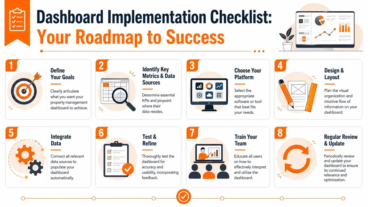
A practical implementation checklist looks like this:
Define one primary use case first
Choose something operationally painful, such as vacancy control, maintenance response, turnover coordination, or owner reporting.List the systems that currently hold the data
That might include your PMS, OTA channels, accounting platform, maintenance ticketing system, and guest communication tool.Decide who will use the dashboard
Operations leads, finance staff, co-hosts, field managers, and owners should not all see the same first screen.Choose the platform based on integration fit
A beautiful dashboard with weak data connections becomes another manual process.Map your key alerts
Decide what deserves interruption. Occupancy dips, unassigned cleans, unresolved maintenance, and message backlog are common triggers.
The video below gives a useful visual overview of how teams approach dashboard setup and reporting logic in practice.
Build the operating rhythm
Once the data is connected, the true implementation starts. The dashboard needs to become part of the routine.
Use this operating checklist:
- Daily review. Arrivals, departures, urgent tickets, guest issues, and same-day turnover risks.
- Weekly review. Occupancy pacing, underperforming units, pricing exceptions, repeat maintenance patterns.
- Monthly review. NOI, revenue by property, owner-ready summaries, and unresolved process bottlenecks.
- Feedback loop. Ask users where the dashboard creates friction, where data is noisy, and what view they ignore.
A dashboard isn't finished when it's live. It's finished when the team stops asking for the spreadsheet because the screen already gives them what they need.
Sample Workflows That Save Time and Boost Revenue
A dashboard proves its value in motion. The gains show up when one event triggers the next step without someone chasing information across three systems.
Workflow one from booking to ready-to-arrive
A new reservation comes in through Airbnb or Booking.com. The dashboard updates the occupancy picture, syncs the calendar view, and pushes the stay into the operational queue. Housekeeping sees the turnover. The guest communication tool schedules the pre-arrival message. The property manager sees any exceptions, such as a same-day clean, a special request, or a blocked maintenance item that must be cleared before check-in.
A smooth stay hinges not merely on booking volume, but on effective handoffs. The more adeptly the dashboard links booking, cleaning, and issue tracking, the fewer last-minute scrambles your team encounters.
For operators building more repeatable systems across multiple homes, this guide on vacation property management workflows and tools is worth reviewing.
Workflow two the weekly portfolio review
The weekly review is where good operators separate noise from trend. You open the property management dashboard and scan for units that don't match the portfolio pattern. One listing has soft occupancy compared with the rest. Another has stable bookings but lower guest sentiment. A third is producing more maintenance drag than it should.
That is where drill-down matters. According to InetSoft's property management dashboard examples, when maintenance resolution time drops from 72 to 24 hours, tenant satisfaction scores rise by 18% and occupancy durations shorten by 12%. The same source says dashboards with drill-down analytics can help managers target underperforming units and achieve a 22% recovery in occupancy within 3 months.
That kind of workflow isn't theoretical. It follows a simple chain:
- Identify the outlier
- Inspect the cause
- Assign the fix
- Review the result in the next cycle
Weekly dashboard reviews are where revenue gets protected. Daily reviews keep operations from breaking. Monthly reviews explain whether the system is actually working.
The teams that benefit most aren't necessarily the largest. They're the ones disciplined enough to run the same review rhythm every week.
Common Pitfalls and How to Avoid Them
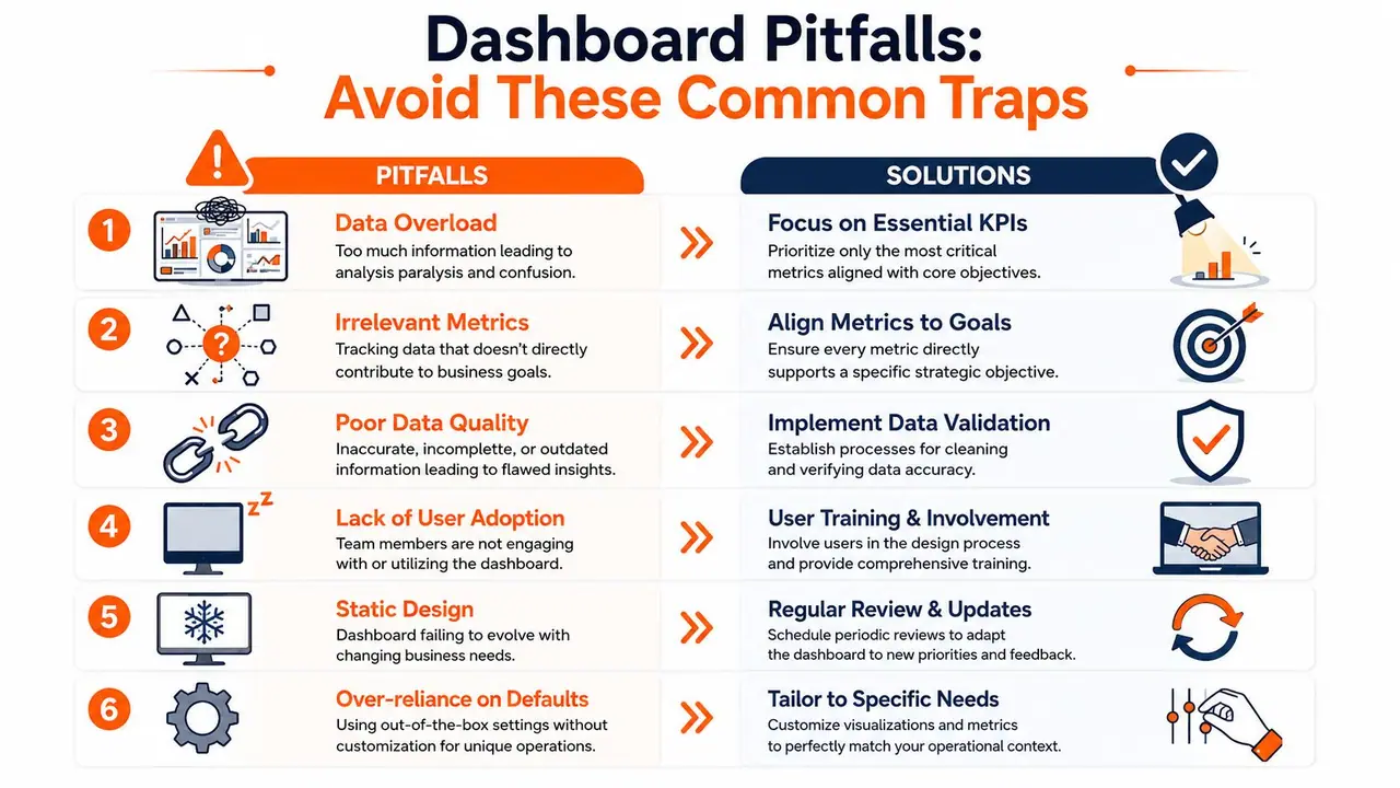
Most dashboard failures are self-inflicted. The software isn't usually the main issue. The setup is. Teams either cram everything onto one screen, ignore adoption, or build generic views that don't match anyone's actual job.
The traps that sink otherwise good dashboards
The first trap is data overload. Hosts often think more widgets mean more control. In practice, too much information delays action. Keep the home screen narrow. Put deeper analysis behind drill-down views.
The second trap is poor integration. If teams still export from the PMS, paste into a sheet, and update owner reports by hand, the dashboard isn't a hub. It's a side project.
The third trap is generic design. A dashboard built for "everyone" usually gets ignored by everyone. According to RentViewer's advice on building a dashboard that gets used, dashboards built around a defined problem and a specific user role achieve 85% weekly engagement among intended users, compared with 35% for generic, non-customized systems.
What durable dashboard use looks like
A durable setup has a few clear traits:
- Each screen has a user. Operations, finance, and ownership reporting need different first views.
- Each view has a decision attached. If the dashboard shows something important, someone should know what action follows.
- The dashboard evolves. Teams should refine alerts, remove unused widgets, and tighten definitions as operations mature.
- Cadence matters more than cosmetics. A plain dashboard reviewed every Monday beats a beautiful dashboard nobody opens.
The honest trade-off is that setup takes effort. You have to define metrics, clean source data, and get the team to trust one operating screen. But once that happens, you stop spending your best hours reconciling systems and start using them to improve occupancy, protect margin, and deliver a better stay.
If you want the guest-facing side of your operation to be as organized as the back office, ScanStay helps you replace paper binders and repetitive guest messages with a single digital welcome book. Hosts use it to centralize check-in details, Wi-Fi, house rules, local recommendations, and one-tap upsells in a simple mobile experience, which cuts support friction and makes every stay feel more polished.